Preparing For The London Book Fair

It's the London Book Fair next week and I'll be popping along for what will be my third visit. When I first attended in 2013 I was like a rabbit in the headlights and a kid in a toyshop rolled into one. The children's publishing area of the Fair is a flurry of bunting and bright colours with beautiful books as far as the eye can see and a constant buzz as editors, sales folk, authors and agents gather around small tables, sipping coffee and talking business. It's a little intimidating to a complete newcomer to the publishing industry like me but also feels like an exciting peek 'behind the scenes'.

I wasn't sure what to expect but quickly realised that the Fair is all about the business of books rather than focusing on authors and illustrators like a literary festival. However, there is still a lot to learn and a lot to see. It's interesting just getting an insight into how it all works. There is a full seminar programme that's free with your ticket with fantastic speakers talking about a whole range of topics. Last year, I learnt a lot more about digital publishing and pitched an idea at an agent 'speed dating' event. And I've been lucky enough to see the likes of Joanna Penn, Eric Huang, Kate Wilson and Sarah McIntyre speak about their experiences in the industry. You can also spend time browsing publisher's stands to see what the latest trends are and mingle with other like-minded souls at Author HQ.

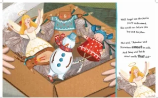
This year I'll be taking along the first drafts of the picture book version of Angel's Great Escape to share with some existing contacts and some new faces. Translating the app to the page has been an exciting and challenging process. My book designer, Sarah Goodwin's advice has been absolutely invaluable and I have learnt a lot about pace, continuity and variation from page to page. And I've realised that sometimes things just need to feel right on the page. The layouts of the app were a lot more simplistic, with a routine design of picture with words at the bottom, whereas the book has exciting fonts, words that leap out and curve and curl around the images. Kristyna has kindly worked on a couple of additional illustrations for me including the cute little chap at the bottom of this page. We've also lightened and brightened some of the colours and added a new image to the last page of Father Christmas looking rather chuffed as he munches on a mince pie. Then there was the back page text to the think of and the cover design for both the front and the back. Overall I am really, really pleased with what our little team has achieved. Holding the proofs in my hands I can hardly believe that Angel was once just an idea fluttering about my head.

In addition to the printed proofs I've created some 'leave-behinds' to give to people I speak to. These are A4 sheets including images of all of the book spreads, a little about the background of the project, a full transcript of the words and key marketing points. The Fair is so busy and everyone has so much to think about, I thought it would be wise to have something quite detailed for people to read through when they get a chance to digest everything back at their desks.

And as well as all the seminars, meetings, browsing and 'Angel's Great Escape speak', I'm also hoping to run into a few Twitter friends from the #colour_collective. I'm really looking forward to meeting amongst the books to put some faces to names and to learn more about their experiences of this wonderful bookish world.
Scilly Laughs Logo Commission

It's all go here at And So We Begin! I'm very excited to announce my second logo design commission. My first commission was for a site that has not yet launched and is a bit secret squirrel so I'll be sharing that with you when they go live.

Meanwhile my friends at Scilly Laughs got in touch to ask me to help to bring their logo design to life. The inaugural comedy festival will take place in June this year. Organisers Brighton-based professional stand-up comedian Julie Jepson and comedy writer and event producer extraordinaire Jo Davies had a very clear idea of the look and feel they wanted to achieve and gave me a brilliantly detailed brief to work from. Julie was keen to include a common sight to the islands, the oystercatcher. And more precisely an oystercatcher throwing a custard pie perched precariously on the festival name. Well, of course!

I researched oystercatchers thoroughly online (although I couldn't find any throwing custard pies...) I studied their expressions, beaks, legs and colours and worked up a couple of drafts. Julie and Jo were keen on using red and blue so I tried different shades for the background and wording to make sure that the combination was working with the colour of the birds. We then worked closely to achieve the final logo, tilting the oystercatchers this way and that to achieve the perfect tipping point!

As social media will be used extensively to publicise the festival, it was important that the logo sat well in a small square to be used as a profile picture. With the two birds the smaller size looked a bit too fussy so I created a second image with just one bird to make it a little simpler.

Working on this logo has been great fun! If you would like to discuss a commission for your own website, company, social media profiles or blog please do get in touch.

In the meantime, make sure you follow Scilly Laughs on Facebook and Twitter to be the first to hear updates about this fabulous new comedy festival. You can also read more about the dates and acts that are booked here.

Setting Up My Etsy Shop

A slightly belated post to say that I am super-pleased to announce that I have opened my brand new little Etsy shop! As I've mentioned, I've been spending a lot of time drawing over the past six months. I always thought I couldn't draw and only started as I needed a distraction. But I soon realised that it's a bit like meditation, totally relaxing and absorbing, so I persevered.

Then came the #illo_advent and #colour_collective Twitter hashtags organised by Penny Neville-Lee which gave me goals and challenges and it became more and more fun.

I ended up with a collection of pictures that I decided to pop on Society6. Partly, if I am honest, because I wanted to buy a couple of my own products! I shared the link on Facebook and Twitter and people started to ask if I sold greetings cards too. This started me thinking that although I love what Society6 does and the fact that they give a shop window to so many amazing artists, I felt like I needed something a little closer to home that felt a little more personal. I also really like the handmade, caring, creative community of Etsy and the knowledge that all of the sellers have put love into their finished products.

So I ordered some stock for my shop. I used a printer in London for my greetings cards and chose a high quality, sustainably sourced card. I also chose A6 for the size as I like smaller, cute cards that feel like a little treat, with simple white envelopes. They arrived within a week and then there were no more excuses so I got to work setting up my shop.

The process on Etsy was really straight-forward. I chose a name for my shop, designed a header and then had to get to work on listing my items. I had a really good look around other greetings cards sellers to see how they photographed their items. I also read the Etsy help pages that recommended natural light and good close ups. I wanted to create a bit of a story with my cards, to put them in context and reflect the kind of person who might be buying them (i.e. me!).

So in my new guise as *Art Director*, I cycled down to the local shop, bought a bunch of daffodils and whizzed back with them peeking out of my rucksack, wavering about in the breeze. I then took photos of each card in several 'poses'. With the vase of daffodils, with the spotty bags that they would come packaged in, displayed simply against a white wall and also in my hands as I liked how this added a human touch.

I then set about writing a little about each card. I wanted my shop to have a friendly, warm tone so tried to write something individual about each design and a bit about whom it might appeal to. I also described the card, size, envelope and how it would be posted in detail so that the buyer would know exactly what they were getting. (No daffodils included!)

I already have a Paypal account and a business bank account so this made setting up the financial elements really easy as I had all the info to hand. The one area that took a little more time was writing my policies. This was mainly because I wanted to be sure that I was writing the right thing so I researched other people's stores and once again read up on the Etsy help pages. You only add your policies once the shop is live so I wanted to be sure I was prepared.

And then I was ready to go! I made the shop live and then frantically checked everything through to ensure it all looked exactly as I expected it to. As soon I was happy I shared the link to the shop on my Facebook, Twitter and Instagram. And waited!

One great thing about Etsy is that it has a detailed stats tool where you can see how many views your shop has had and also which products have been most viewed. In addition, the site tells you where your traffic has come from which is really helpful. In the first 24 hours I had 158 views and 3 orders. I was delighted! It's a real thrill to know that people like what you have a created. I packed up my first orders carefully and posted them the next day.

I realised that you can send a 'Your order has shipped!' email to your buyers and this can also be cc'd to your own email address. The emails look really professional and clean cut which really adds to the service.

I'm really looking forward to creating more cards for my little store and to perhaps branching out into other products too. In the meantime, please take a look at my shop and get in touch if you have any ideas for cards you'd like to see or even for private commissions, I am always open to ideas!

© 2015 Kirstie Rowson & And So We Begin Limited. All rights reserved. Please do not publish designs elsewhere without permission from And So We Begin.

Contact hello@andsowebegin.co.uk with any queries regarding publication or distribution.

The First Draft

And so we... finish! After six long years of plotting, scribbling, typing furiously, thinking, getting stuck and editing (A LOT of editing!) the first draft of my children's novel is finished. And although I know it's not really finished, it still feels exciting and strange. It's a relief to finally have a complete draft but also a little unreal. Suddenly this story I have absolutely loved writing is out of my head and on the page. I am so chuffed and also a little bereft!

I honestly don't remember when I first thought of the idea for the book. When my friends ask me how I came up with it, I can't answer because it seems like the story has just kind of been there for a very long time. Maybe for a decade. What I do know is that certain scenes jumped out and demanded to be written first. The opening few paragraphs but also for some reason, the paragraphs that became chapter eight. I always knew the basics of the beginning, middle and end but actually writing it has been brilliant and also a huge learning curve.

I thought I'd write some notes about what I have learnt...

1. It helps to make it a habit
I work in event management by day so my work can be erratic and all-consuming. Over the course of the first three years I only managed to write about 8,000 words. But then I was lucky enough to be able to give myself a brief three month sabbatical in which I wrote nearly every day and jumped up to almost 55,000 words. It took about two weeks of sitting down to write at 9am every morning for it to become a habit. Then I found I really missed it when I wasn't able to write. It reset my habits and then even when I was working hard at my day job, somehow I would find time to write. It was addictive. Even I wanted to know what happened next!

2. It also helps to step away
Having said point 1, when I did have to spend time away from what I had written, it was good to come back to it with a fresh mind. When I had a big gap, I would read through the whole thing like I was reading it for the first time. Sections I had 'over-written' or that were really clunky would jump out and bits that flowed felt more and more right.

3. Making notes rather than making immediate changes
Quite often as I was writing I would think of something small that needed to be changed earlier in the text, for continuity or to make a later plot point make sense. Rather than make the change there and then, I would jot notes at the bottom of the document to change later. I found this helped as it meant I wasn't interrupting my own flow and also knew I wouldn't forget to make updates.

4. Plotting out
After I had written my first 8,000 or so words I realised that I really needed help to understand the intricacies of my own story. I have co-written three books before but they were non-fiction wedding, hen and stag guidebooks that could be plotted very logically. I am a very visual person, I'll often ask someone to sketch something out to help me to understand it. I needed to see my plot. So I wrote out my plot points on post-it notes and plastered them all over the wall above my desk. I lived with them for about six months while writing. Staring at them, moving them around. They sparked my imagination and gave me more ideas. It made me wonder why I hadn't done this right at the start!

5. Sometimes the characters write the story themselves
Even though I had plotted the story out in detail as I wrote my characters started to do what they wanted. One day as I typed, two of my characters started having a huge fight, it wasn't what I'd sat down to write but they had taken charge and seemed to know more than I did about what was going to happen. I couldn't write fast enough. It was like trying to live subtitle a news story. Who was I to argue? I learnt to follow the story and to relax and let the characters say what they wanted. They usually had a good point to make!

6. Edit away from the screen
Printing the manuscript out and reading through it on paper feels like one of the best ways to edit to me. It allows me to read more easily than on the screen as I can flick backwards and forwards and scribble notes in the margins.

Being away from the screen is also a great excuse to sit in lovely cafes and to spend time around people instead of squirrelled away at my desk. Something about the hubbub of a cafe somehow helps me to concentrate. And then I can return to the laptop to actually make the edits to the document feeling refreshed.

7. Keep your eyes on the prize!
Throughout the journey so far, one thought has remained with me. I just can't imagine not writing the story. I picture myself at 95 in my rocking chair (probably drinking a gin and tonic) and think about how I would feel if I always had this story in me and had never told it. Not because I think the world needs to hear it as such, it's more that I needed to write it down. It's like it was shouting in my head until it got listened to! The characters are like my friends and I wanted to sit down and listen to what they had to say.

When I have wavered and wondered whether I will ever get to the end, I take a stroll to a bookshop and look at where the book would sit. If (I can hear my inner monologue shouting 'WHEN!') it gets published it would nestle next to the queen of children's literature on the shelf. My last name is Rowson, so there I would be next to JK Rowling. And now next to Katherine Rundell too. Not a bad place to sit!

8. Release it into the wild
And so as I type, the first three chapters have been sent off to the first agents on my list. And there it sits, in inboxes, on desks, in the hands of experts who can help this little journey continue. I really hope they love reading it as much as I have loved writing it.

*bites fingernails and waits for the next chapter...*

Illustration Inspiration

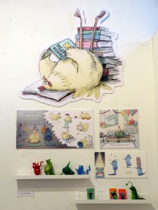
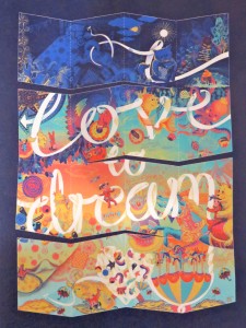
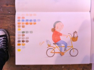
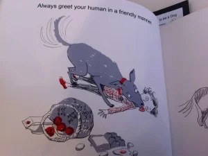
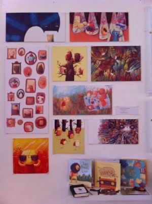
I was lucky enough to have time to visit the Cambridge School of Art's Children's Book Illustration Graduate Exhibition today. I have visited the exhibition before and now know to put it in my diary as it is always so wonderful. The calibre of the work is incredibly high and the styles of the artists are really varied.

One of the main things I enjoy is the absolute treat of being able to look through the illustrators' sketch books. It seems to me very brave to share your sketchbook in its entirety, like a sneak peek into the workings of the individual's creative mind. You can also leave comments and gather beautiful business cards with artist's website addresses so you can browse more of their work later.

This year really didn't disappoint. I wandered around for almost two hours absorbing the detail and care that the students had put into their presentations. Where else can you see a hoovering dog, a pencil princess, a party planning chicken and a lion who lives in a dance hall?

Below are just a few of my photos. So much gorgeousness! Please click on each picture to link to the artist's own website. All artwork is of course the sole property of each artist.

Colour Collective Continues

It's already week 6 of #colour_collective and I'm busy working on my drawing for this week. Penny's chosen colour is Flame Red which puts me in mind of heat, love, devils, jammy dodgers, wild strawberries and penguins in jumpers!

It's unusual for me to think about what colours 'say' to me. I have never thought in that way before. That's why this challenge is so fascinating to me. It's one thing when you are asked to draw something but another when you are asked to draw what you are inspired to draw by a colour.

In week 3, the colour was ultramarine. My first thought was of neon tetras. I remember seeing a massive tank full of them in an aquarium and being hypnotised by their blue light. I spent an entire evening drawing them and playing around in Photoshop trying to get an image I was happy with.

The next day I was writing in a cafe and there was a poster on the wall of a super-hero, wearing a blue costume. And not just blue but ultramarine. In an instant Ultramarine Girl came to me and neon tetras were forgotten! Here she is… WIth super-powers in her flippers! I really struggled with the hair and need to spend some time practicing and understanding how other illustrators make it look so effective.

The following week was Sap Green. The word 'sap' made me think of forests and ferns but when I started drawing this little one appeared (see below). I'm not sure where she came from! But sap green suddenly said 'wellies'!

I experimented a bit more with colour in this picture. The little ones in my life love wearing bright colours that clash so I chose a bright pink and orange to go with the green. I've noticed how other illustrators use a darker version of the same colour to layer and give a more 3D feel so I played a bit more with texture and shading in Photoshop using this technique.

I also experimented with the space on the page. Placing her at the bottom of the page added to her 'story' and neeeeeeed to be carried! Then adding a lighter coloured, patterned background rather than plain white gave the picture a little depth.

Then came week 5 and Brilliant Violet. I immediately thought of Violet Beauregarde and her bubblegum. Then of a girl called Violet who was brilliant. Then I put the colour with orange in my mind and was transported to Jaipur in a swirl of coloured saris. I have wanted to start drawing in more intricate detail as I am so inspired by work of people like Mouni Feddag and Nina Cosford.

I wanted to nod to this in a very small way and started to draw some patterns. I find that sometimes my logistical mind that I need so much in my daily job limits my ability to draw 'loosely'. I compromised by drawing patterns as a word to give them structure. Next step, free form! I then found myself going back to my comfort zone of drawing a child to accompany my patterns. I have to confess to being quite pleased with how comfortable she looks! I quite fancy that armchair myself.

As a complete beginner, I have to say how completely inspired I am by the #colour_collective group. It gives me a focus, a challenge, lots of fun and a lovely feeling of community. More and more people join each week. We post our pictures at 19:30GMT on a Friday (or as close as we can!) and there is absolute flurry of excitement as we look through everyone's work. There is such a feeling of camaraderie and awe. And it's very much 'more the merrier' so why not come and join in!

Creative Challenge: Colour Collective

After #illo_advent finished on Christmas Eve, I found myself wanting to draw *ALL* the time. I really missed the daily challenge and still found myself waking up thinking about what I was going to try to draw that day. I missed sharing my pictures too and looking through everyone else's fun illustrations.

So I was *VERY* excited to see that Penny Neville-Lee had decided to start another illustration challenge for the New Year. The #colour_collective challenge started last week and it feels a little bit like it's Christmas again! Penny posts a chosen colour on Sunday night and not just simple colours but paint colours with gorgeous names that sound like magic spells.

Then all week illustrators (and amateurs like me!) work on their pictures; drawing whatever the colour inspires. Then at 19:30 GMT on Friday eve there is a flurry of activity as everyone posts their pictures at once with the hashtag #colour_collective.

It's great fun! I drew week 1 by hand and then coloured it in Photoshop but this week I bought a Wacom tablet and pen so had my first foray into drawing digitally.

Week 1: Cadmium Yellow
I decided to play with a little texture on this one, I'm not sure it's quite working but I like how much the yellow stands out on the dark blue.

Week 2: Opera Rose
As a cheeky little extra, I've added a little animation to this one!

Creative Challenge: Illo Advent

I've always liked drawing but was very self-conscious about it which stopped me from scribbling. I worried about every line and my pen hovered over the page nervously, not daring to make a mark. Then last summer while waiting for a delayed train one day, I started to doodle. I was just passing the time but by taking the pressure off myself I suddenly found myself totally absorbed.

I realised it was something I could do creatively when my mind was too full of my day job to be able to write. I became less and less worried about what my drawings looked like and just began to enjoy it. I found it relaxing, almost meditative and I decided to share my pictures on my personal Facebook page, just for fun. My friends were kind and encouraging. So when I noticed a little Christmas drawing challenge on Twitter (#illo_advent), started by fellow Twitterer Penny Neville-Lee. I took a deep breath and with some trepidation, decided to take part.

It was brilliant, habit-forming, social and just really good fun. It made me practice and try different techniques. I loved learning from the brilliant illustrators taking part and being part of a new community which felt a bit like a secret club.

Here's a little selection of the drawings I did through the challenge, in no particular order. Some better than others!

New Review: Ink Robin

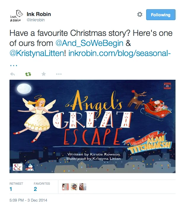
We had a lovely surprise today when a little Tweet notification popped up letting us know that storybook app creators Ink Robin had posted a review of Angel's Great Escape… All the way from Toronto! The team there will be reviewing more Christmas stories throughout the festive season and we are delighted to be the first on their list.

You can read their blog post here. There is also a fantastic video featuring their own lovely storybook apps. Take a look!

Thank you so much Ink Robin!

Alan Titchmarsh To Narrate Wind In The Willows

I was so over the moon when Alan Titchmarsh agreed to narrate the original Angel's Great Escape app in his warm, Jackanory tones. Now he is about to make his West End debut as Kenneth Grahame narrating Wind In The Willows and I, for one, can't wait to see him tread the boards. The show is on at the Vaudeville Theatre from 26 November to 17 January, a perfect Christmassy treat for all the family!

New Review: Baby London

So pleased to see this lovely review of Angel's Great Escape in Baby London magazine, the must-have luxury title for mothers living in and around the capital. Written by The Book Sniffer who has always been so kind and supportive of the story, the review also mentions our Snow Globe app. It's so nice to see Angel revive each year, it's like welcoming back an old friend!

From pregnancy to toddler, Baby London is the essential bi-monthly guide through motherhood from beautiful bumps to busy little bees. With intelligent, up-to-the-minute editorial content on the latest expert advice, products and trends, Baby London is a stylish, informative breath of fresh air and a magazine every parent will enjoy.

Our Second Birthday

It was And So We Begin's second birthday this week so we put the birthday bunting up! And celebrated with cake, obviously. And as Autumn rolls in with her blustery skies and auburn leaves I started to think about everything that has happened over the past two years. I created And So We Begin to give my Angel's Great Escape story a platform and with the intention of sharing stories in whatever shape or form they may come. The advantage of being independent is that I can juggle my day job as a freelance event manager with writing and creating and I can work on ideas in a very organic way with no pressure other than that I put on myself. Last year, my little team and I created the Snow Globe app to sell alongside Angel and this year, we started work on turning Angel's Great Escape into a picture book.

I've been able to take my time with the picture book layouts, working with the lovely Sarah Goodwin to bring Kristyna Litten's beautiful images to the page. And with some space to revisit the story and the help of a professional editor, we've made some changes, added a Mrs Mean character and refined the meter of the rhymes.

I would love to receive more feedback on the story to ensure we get the picture book exactly right with the intention of sharing it with publishers next year. I love putting a project together and am enjoying learning about the various aspects of publishing a picture book. Fingers crossed, Angel and her friends will find a home and be available at a book shop near you in the next year or two.

In the meantime, I've been thinking a lot about creativity lately. It's my hiding place when times are tough. It's my relaxation and a way to be myself. Whether it's a photograph, a drawing, a scribbled note, a first draft of a novel that needs (a lot!) of editing or a rambling blog. Through some difficult times this year, I have found creativity very healing and I hope to write more about this soon.

So happy birthday us, here's to many more years and many more stories! For now, a second slice of cake is calling!

Books About Town

After a rather long break from creativity due to work, I've recently been lucky enough to have had a chance to re-absorb myself in the creative world. Drawing, photography and writing always help me to get back in touch with my ideas. So a trip to see the beautiful Books About Town benches proved a perfect way to spend a morning.

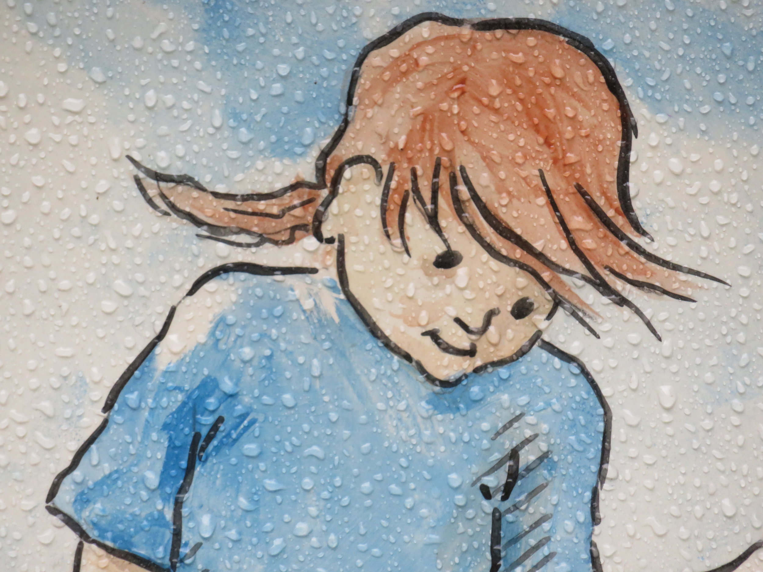
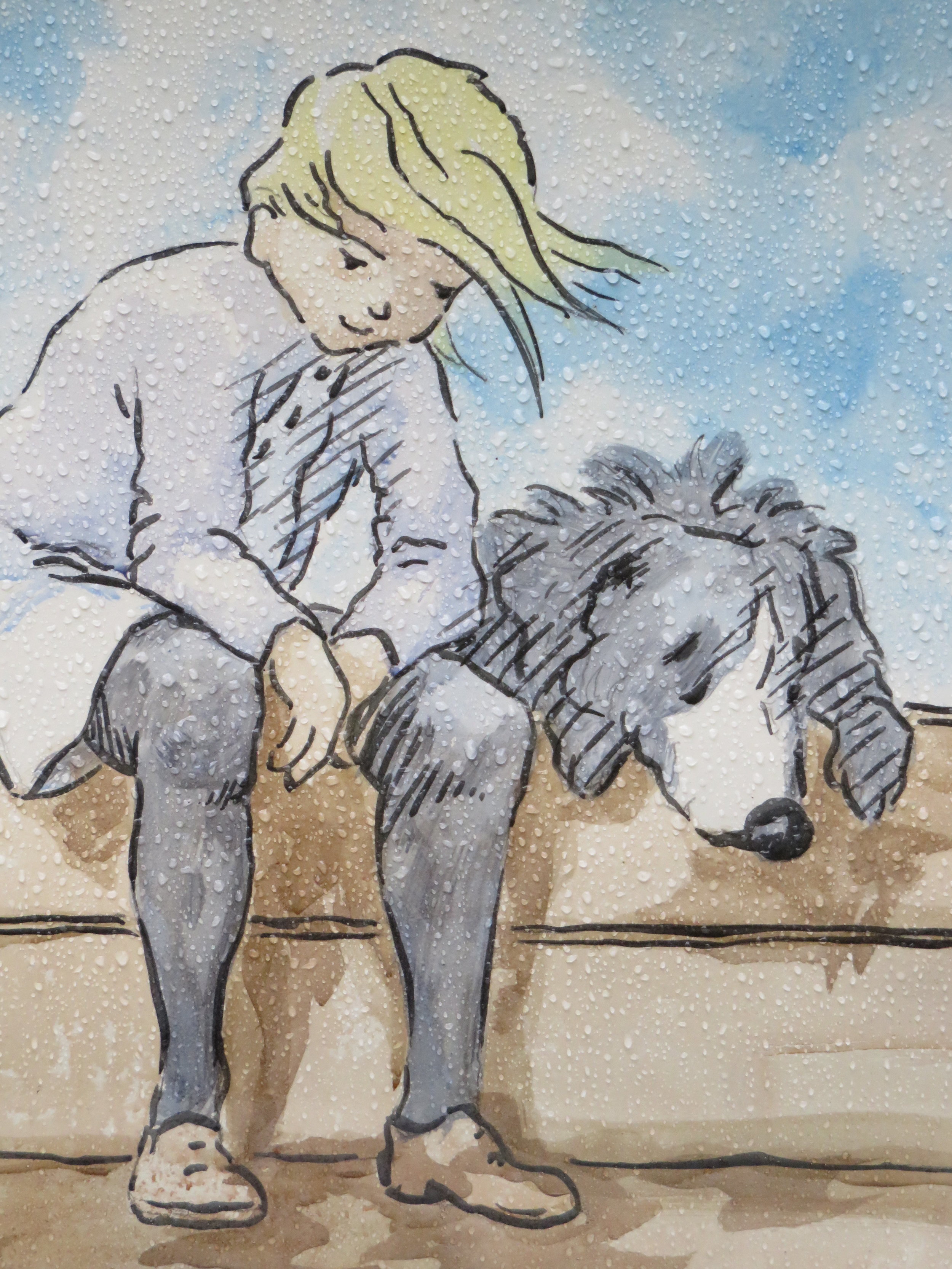
All fifty benches were on display in Gordon Square last weekend before being auctioned and raising an incredible quarter of a million pounds for the National Literacy Trust. I took the opportunity to take a close look at the wonderful artwork. The heavens opened as I walked around but the rain somehow added a certain something to the pictures. Lovely.

Introducing Mrs Mean

Those who follow me on Twitter or who follow this blog, will know that we are busy creating the Angel's Great Escape picture book. If you have the app on your smartphone or tablet you will know the story of our little Angel well and will have seen how she wants to escape the miserable Meanies to get to the Good Family over the road. The Mean Son tells his mopey Dad how he thinks Angel and her decoration friends are all rubbish and that they should be thrown out. But where was Mrs Mean? And have you ever wondered what she looks like?
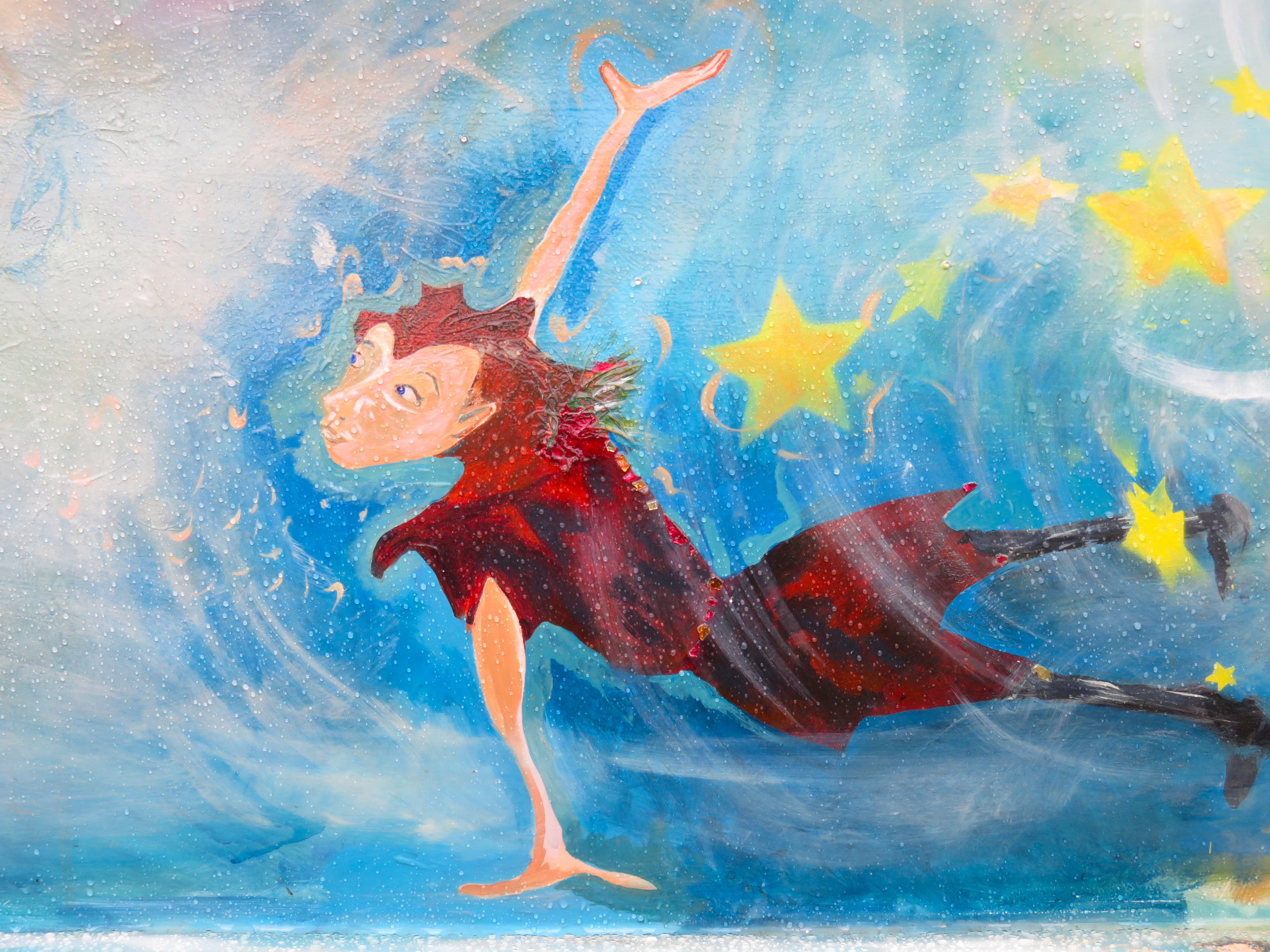
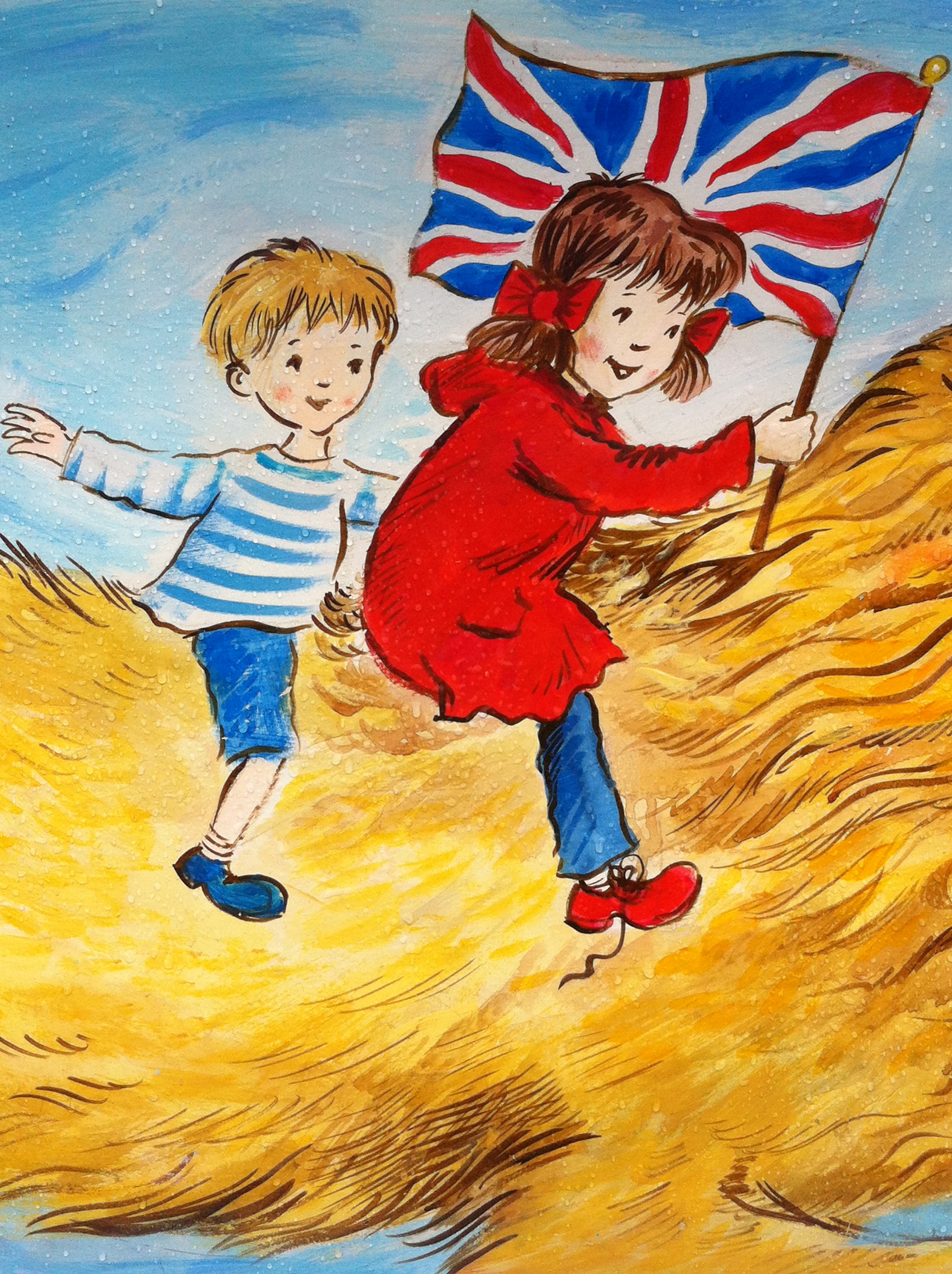
Well, it seems she was busy preening herself in the lounge mirror when the picture of Mr Mean and his son was drawn but now we're planning to produce a print version, she is ready to make her first appearance! Ooo, look at that sneer! She may be a Meanie but we rather like her.


Creating A Picture Book Contd!

Things are moving on a pace at And So We Begin and we are busy making the final tweaks to the picture book layouts of Angel's Great Escape: A Christmas Story. Our lovely designer, Sarah Goodwin, has done a wonderful job of translating the words from app to page. I imagine this is a fairly unusual way of making a picture book as usually the book would come before the app. Or an app would be simply an app and would not be reinvented as a book. Do get in touch if you know of anyone who has taken on a similar project or you have done so yourself!

From app to book
The story is written in rhyming text and in the app version each couplet is displayed separately in a very consistent way. We can also have numerous couplets on one page by using the arrow mechanism to 'scroll' through the text. In the book, our space is more limited. Also the illustrations were designed to have the text at the bottom, as per the app and not to have text displayed within them, in the way that a picture book would be. Sarah has done a wonderful job of finding her way around this by tweaking the images and adding different backgrounds and layers to the spreads.

Here's an example of a layout from the app vs a layout from the book with the app version on the left. You can see that a white section and blue line have been added to the right of the main image for the book version to allow space for the text to be displayed.
 

Copy editing
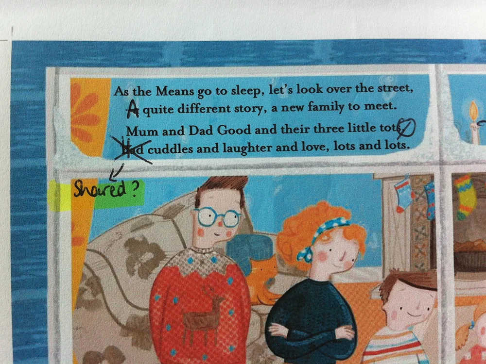
One additional and vital step we've taken in the past couple of weeks is to have the copy for the book professionally edited. Again, an introduction through a friend was invaluable. It is amazing what a new pair of eyes can see! From capitalising words, to spotting missing commas, to suggestions for revised sentence structure and word replacement. I have lived with the story for so long that it is really refreshing to hear a new opinion of it and to learn how some very tiny tweaks can improve the flow. Luckily there's no need for a major overhaul (phew!) but we are making a few small changes for the book version, which, of course, means changes to the app too but I'm excited that we are getting to a place where both formats will be the best they can be. Now, it's onwards to plans for printing and spreading the word... But more on that soon!

Illustration Inspiration

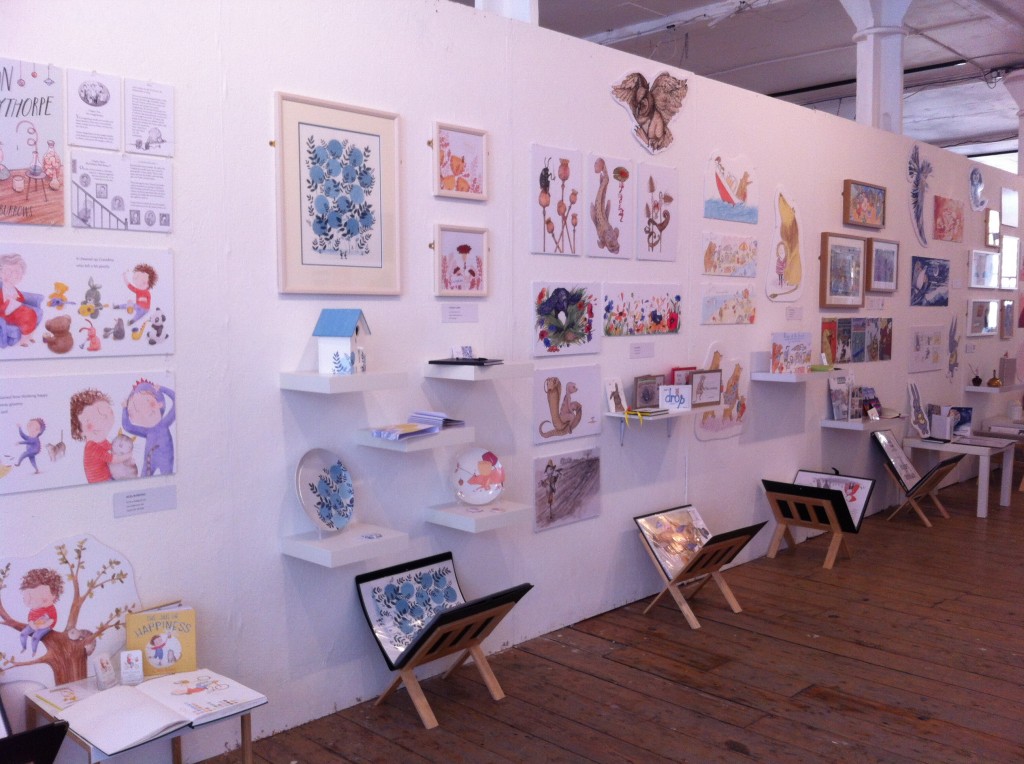
I spent a wonderful morning yesterday strolling around the Cambridge School of Art Show for their MA students of Children's Book Illustration. It was the last day of the show and I'm so pleased that I made the journey to go. I have been to the show before when it was held in Foyles and the new Candid Gallery venue was a lot larger, light and airy and an absolute feast for the eyes. Portfolios laid out to browse through at leisure, mocked up picture books to handle with care and beautifully displayed artwork on the walls. It was hard to know where to begin!

The displays were so absorbing and carefully put together with comments books of many different styles to scribble in. Some of the picture books made me giggle out loud, I wouldn't be surprised at all to see several of them picked up by publishers and on sale in the next year or two. If I were a publisher, there were certainly some gems I would consider investing in.

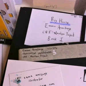
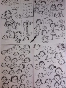
One particular treat was seeing some of the artists' sketchbooks, like a sneak peek 'behind the scenes' of becoming an illustrator. Here are a couple of pictures of Emma Armitage's that were on display.

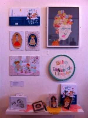
Below are just a few of the photos I took, I honestly could have snapped all day as this is a mere snippet of the wonderful work that was on display! Please click on the pictures to see more about each fabulous illustrators' work.

Creating A Picture Book

As I've mentioned a couple of times both here and on Twitter, we are busy creating a picture book version of Angel's Great Escape and I wanted to share some of my experience with you. My decision to publish the book independently was largely due to my love of projects. A lot of people talk about those who self-publish wanting to have control over their work and I understand that in some way. But for me, it's not so much about control as about being a part of it all, being completely engaged in the whole process, learning and enjoying seeing it all unfolding. With a little bit of impatience thrown in!

About 8 years ago, I sent the Angel story to several animation companies who all advised that I should create it as a book first to find an audience as they thought it would be difficult to fund without proof of readership. So I set about rewriting the story as a book. Storybook apps were just emerging and I saw this as a middle ground between animation and books. The idea of publishing the story myself really appealed to me. I could be proactive, join with like-minded creatives, see my story come to life as I imagined it. And so, while I researched how to create a picture book, we created the app and I couldn't quite believe it had happened. This Angel who had danced around my mind for years was finally smiling at me from the screen and if I tapped her, she moved! More importantly, I sat with children as they read the story and saw the smiles on their faces. That, for me, was what it was all about.

So, now, on to the picture book. When I was little my favourite book in the world was The Story of Father Christmas by Ann and Dennis Mallet. It made me feel so cosy and comforted and I would love the Angel's Great Escape picture book to make children feel the same way. Having published the story as an app, I'd like to share the story with more children, to reach those who don't have an iPad, whose parents prefer books. And I'd like And So We Begin to take it's first steps towards becoming a traditional publisher. Stories come in all shapes and sizes, apps and books. Even though I am essentially self-publishing, I like Joanna Penn's thinking of it as independent publishing. It is far from simply myself creating this book. I am slowly establishing a lovely team around me who care as much as I do about the book and who are all contributing to making the book as good as it can be.

So after a rather rambling introduction, here are three stages we have been through with the book on it's journey so far.

1. Illustrations
Self-publishing has really opened up for novelists with the use of CreateSpace and Lightning Source so writers can be completely independent if they choose to be. But a picture book isn't quite so straight-forward. The finished product needs to be a perfect balance of words and pictures, with the two feeling as if they were always meant to be together. I had already commissioned the fabulous Kristyna Litten to illustrate the app and chatted to her agent at Arena about amending the contract to incorporate the use of the illustrations in a picture book too. Luckily, Kristyna's illustrations for the app were already high resolution and print ready due to the requirements for this for the retina display on the iPad.

So how can you find the right illustrator for you? When I was first looking for an illustrator, I went to graduate illustration shows such as the Cambridge School of Art MA Show to seek out emerging talent and I also spent a long time loitering in bookshops browsing through the picture book shelf seeing what style felt right. Karen Inglis has written a great blog post about her own journey and reveals that she found her illustrator through Elance. In the end, it was Arena Illustration who recommended Kristyna to me saying they thought her style would fit the story and as soon as I saw her sample sketches, I knew they were right. The picture below is just a tiny peek but you can see how close the original designs were to our finished product.

2. Structure
We are working with a picture book layout of 32 pages with end papers and hardback cover for Angel's Great Escape. Despite it initially seeming that 32 pages should equate to 16 double-page spreads, the title pages and copyright page also have to be considered. Whilst taking into account the limitations and also the illustrations that I already had, I took a step back and thought about how I would have structured the story had the app not been made. I found it helpful to sketch out the pages, numbering them 1 - 32 and then making a note of what the illustration and wording would be on each page. I also learnt a lot from looking at lots of other picture books to see how they were laid out. For example, I'd never thought about end papers before and realised these add to the beauty of the picture book. Here's a sneaky peek at ours.

3. Design
Closely entwined with structure is the design of the book and this was where I felt it was time to call in the professionals! Again the lovely Arena ladies came to the rescue and recommended a fabulous freelance designer to me. We met to have a chat through the project and within one meeting it was clear how much her experience would bring to the project. She understood immediately that I wanted the book to have its own personality rather than to feel like a transfer of the app on to paper. She made me realise that creating the book would give me an opportunity to play with different styles, more elaborate fonts and singled-out spot pictures. A professional book designer also knows how files need to be sent to print, how to ensure the colours will look true to the design and what fonts will appeal to readers. All vital with a picture book.

The layouts are now almost complete. We have had four face to face meetings over the course of four months which have been invaluable. We spend a couple of hours each time going through the designs with a fine-toothed comb. Kristyna created her artwork with many layers in Photoshop so the illustrations are very malleable. Each character has the possibility of many expressions and poses so the designer can play with these as well as experiment with the proportions and positioning of the text. Some spreads have what is referred to as a full-bleed, meaning the background image fills the pages, whereas some spreads have a white background with a 'spot' picture and some text. As soon as we are 100% happy I will share some of the pages with you.

The process of creating a picture book independently has already been a huge learning curve for me and we've barely started! The next steps are copy editing, deciding which printer to choose and working on the marketing and distribution plan. But more on that later!

I'd love to hear from you with your insights, advice or thoughts especially if you are creating a picture book independently too.

New Year To Do List

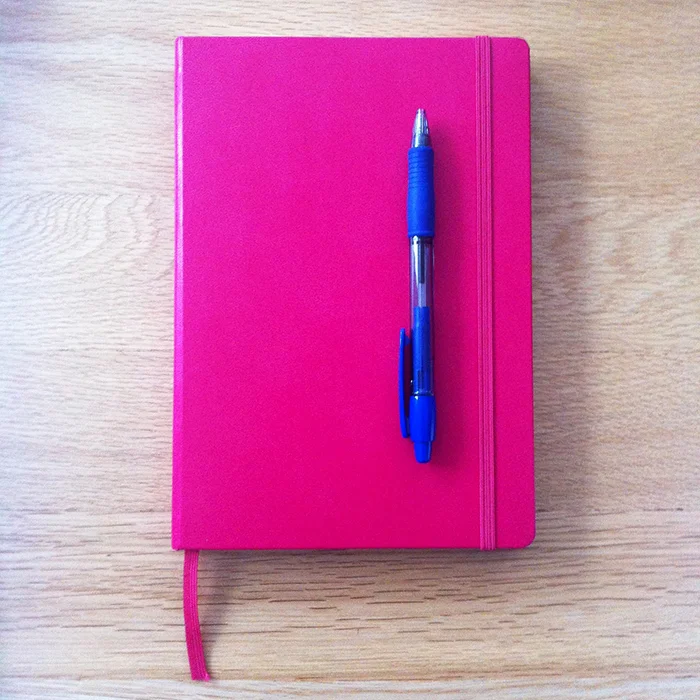
Here at And So We Begin central (also know as my desk) the year is off to a project-packed start. This obviously called for a new notebook. In And So We Begin Pink. It's my first Leuchtturm1917. It's got a contents page and page numbers. And yes, I'm going to say it, I think it might be better than a Moleskine. Gasp.

Before we all keel over with the shock of my last statement, here's a little peek into my New Year To Do list.

1. Angel's Great Escape - The Picture Book!
Although I started the company to publish my story, Angel's Great Escape as an app, I have always seen the story in other formats too so this year I'll be taking a sideways step into the world of traditional publishing. It's already proving to be quite an adventure and I'll be sharing a bit of insight into the journey in another post shortly.

2. The Novel
Last year I started work on a novel for 8 - 12 year olds. At about 50,000 words in I had to go back to my day job of events management and my characters were left dangling. This month I have had time to finish the novel which has meant a lot of re-reading and editing. Then a week or so ago there was a flurry of excitement on Twitter as Chicken House Books announced that they were having an open submissions day because 'everyone is a bit gloomy in January'. It certainly brightened my day. And my five chapters are ready to send off tomorrow!

3. The Radio Sitcom
For the past six years I have been working on a sitcom script with one of my best friends. It's all a bit top secret squirrel but this month we have been re-writing the sitcom as a radio pilot. After six years of writing and re-writing, we know our characters really well and can often be heard saying things like, "Oh no, he wouldn't say that, he'd say…" We had a read-through with some friends last week and recorded it so we could hear the script as if it was on the radio. It was a merry-go-round of accents and attempts at sound-effects. With some more tweaks it's now time to send it to an 'interested party' (she said mysteriously!)

4. The Next App
I had a great meeting with Stefan, the developer behind my first two apps, last week. He is working on some really interesting coding at the moment that has given me lots of food for thought about my next app project. We talked about children being able to use apps to tell a story themselves which is an idea I find interesting. I also followed the London Book Fair Tech Tuesday on Twitter this week. Nosy Crow did a great write-up and I was particularly interested in Stuart Dredge's comments about delivering stories differently. The idea I have been working on has the potential for more engagement so I think a little more time on the drawing board before moving forwards will work well.

So in summary, LOTS of writing to do. Best get back to that Leuchtturm1917!

*Freebie* Make Your Own Christmas Decorations!

We've got a fun little Christmas treat for you! Download our Make Your Own Decorations PDF and have lots of fun making your very own deccies ready for your Christmas tree.

The colouring-in sheets feature the characters from Angel's Great Escape: A Christmas Story, including Angel, Fairy, Reindeer, Snowman, Teddy and the main man himself, Father Christmas.

Print them out, colour them in however you like and then add a bit of sparkle and a piece of ribbon and *TA-DAH!* they will look wonderful hanging in amongst the fairylights!

We would LOVE to see your decorations. Please email your pictures to hello@andsowebegin.co.uk and we will start a new Christmas gallery here on our website to display them.

Happy decorating!

Snow Globe: A Christmas Treat Is Now Available!

We are VERY excited to announce the launch of our second app, Snow Globe: A Christmas Treat!

Snow Globe: A Christmas Treat features Angel and her decoration friends from our first storybook app, Angel’s Great Escape, illustrated beautifully by Kristyna Litten. Place them in the snow globe where you wish, choose one of three background scenes and either gently shake your device or tap the snowflake to see the snow fall around them. Snow Globe is accompanied by Ginny Walker's twinkly Christmas lullaby, Leap of Faith.

We hope that your little ones will enjoy playing with the Snow Globe. It is sure to put you all in a Christmassy mood as the festive season approaches!