Etsy Shop Photoshoot
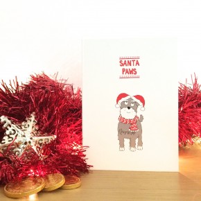
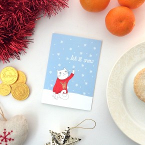
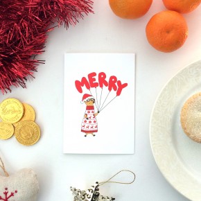
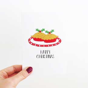
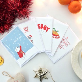
My Christmas cards arrived from printed.com last week (cue much excitement from me!) and I set a day aside to take some photos of them ready to put them on sale in my Etsy shop. I wanted to set up a Christmassy scene for the cards to give the photos a nice festive feel so I popped to the shops and bought some Christmas bits and bobs (also a rather good excuse to stock up on chocolate and mince pies).
Once I'd laid everything out at home I put White Christmas on the TV to get myself in the mood and tried out various arrangements. I found it helpful to take some test photos using my iPhone and quickly found that some props worked better than others.
When I'm taking photos to put on Instagram I really like having a white background. It's light and bright and really seems to highlight what's in the picture. I played around taking a test photo which included my tea strainer that I was using to sprinkle icing sugar over the mince pies. Sometimes it just has to feel right and this set-up felt like it would show the cards off nicely so I took a photo of each card in this style.
I also took pictures of my hand simply holding the cards and some of the cards standing on the table with the tinsel and fairylights or with the chocolate Father Christmas (whilst trying not to eat him and the chocolate coins). It was fun experimenting to see what worked. And it was also fun eating mince pies while I pondered. Well... There were six and I only needed two for the pictures.
Since taking my photos I watched a lovely video from Makelight about making a flat lay. I would recommend having a look as Emily Quinton is a professional photographer who runs workshops in online photography and she has a really pretty style. The flat lay I created for my photos is quite simple in comparison to hers and it's made me want to try this technique again in the future.
After reviewing my photos, my top three pointers would be:
* Take pictures with natural light. It was a gloomy day when I took mine so I worked on my set-up as close the window as possible.
* Don't use a flash. The flash make the light glare and highlight unnaturally which makes the photo look unbalanced.
* Don't clutter the composition too much. Ensure the focus is the product rather than the props!
Once I'd taken my photos I brightened them up a little in Photoshop (but this can easily be done with apps on your phone too) and then set about writing product descriptions and uploading them to Etsy.
And as an extra treat, here's a clip from the lovely movie that helped with the atmosphere for my little photoshoot : )
