Pretty Post by And So We Begin

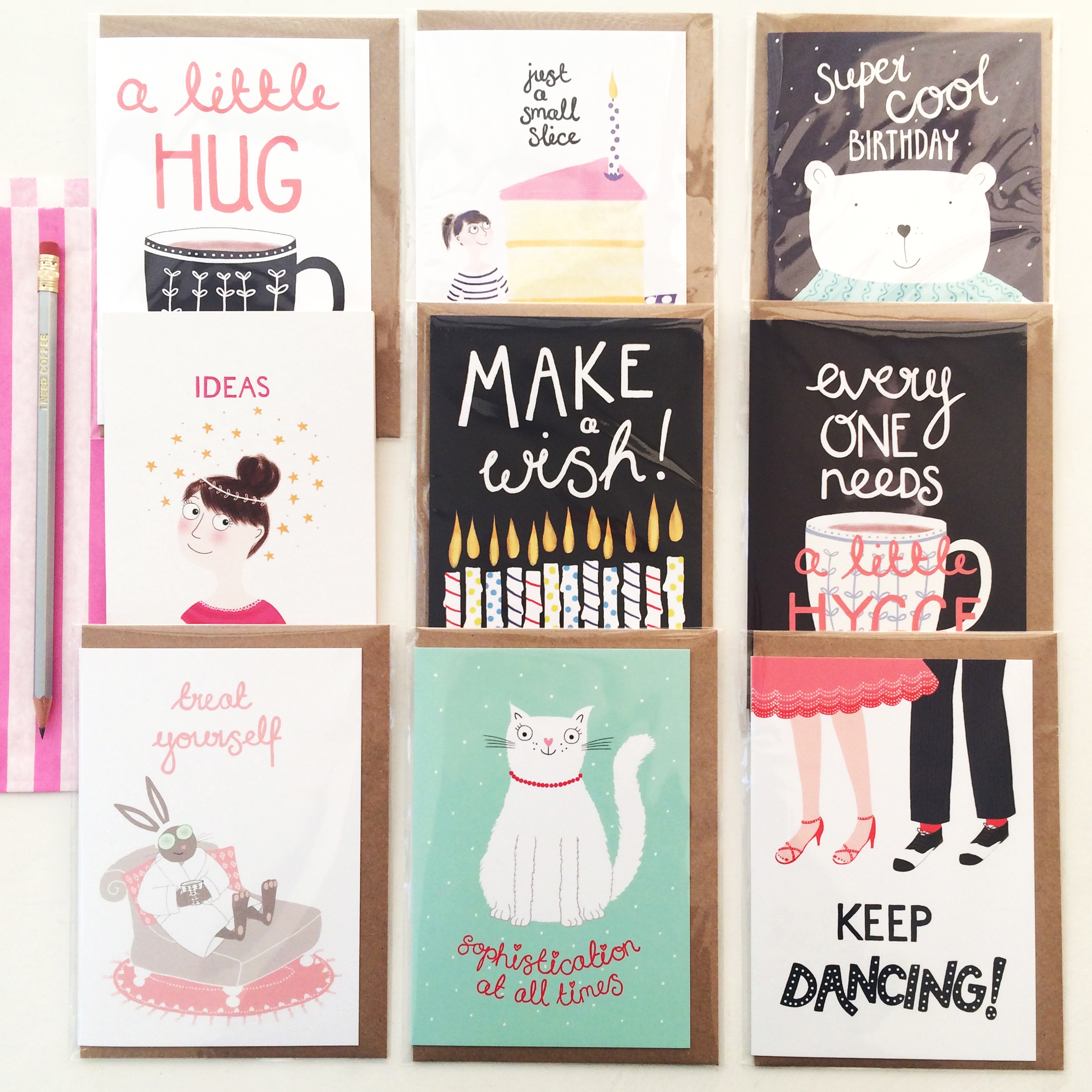
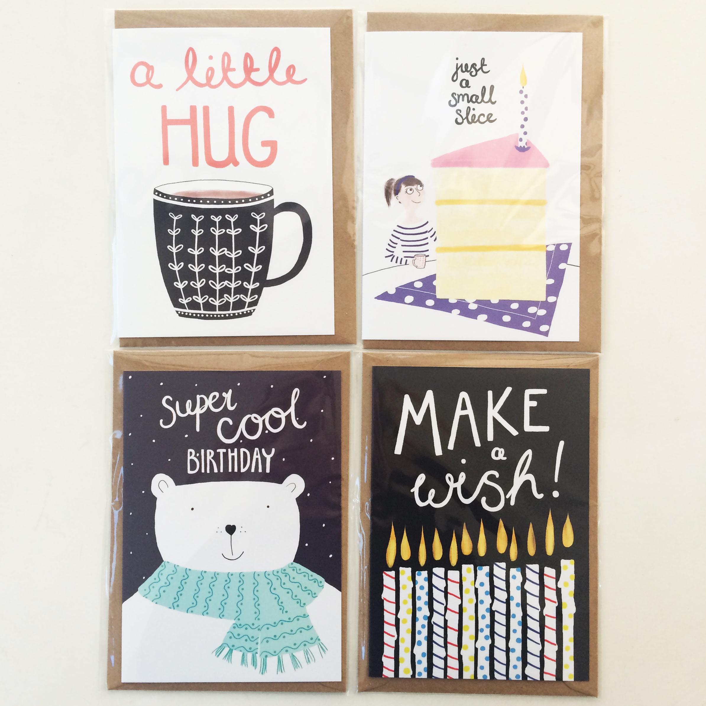
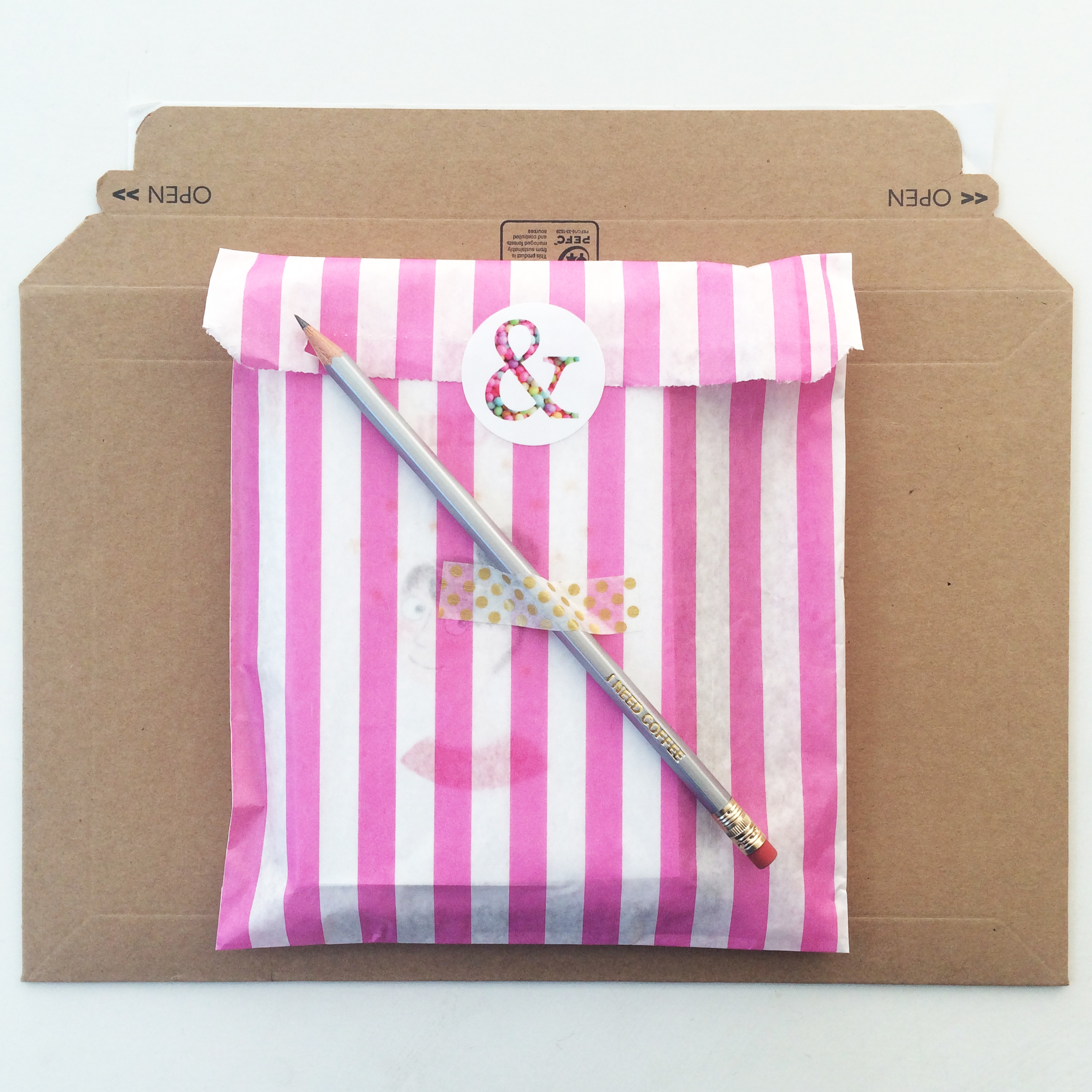
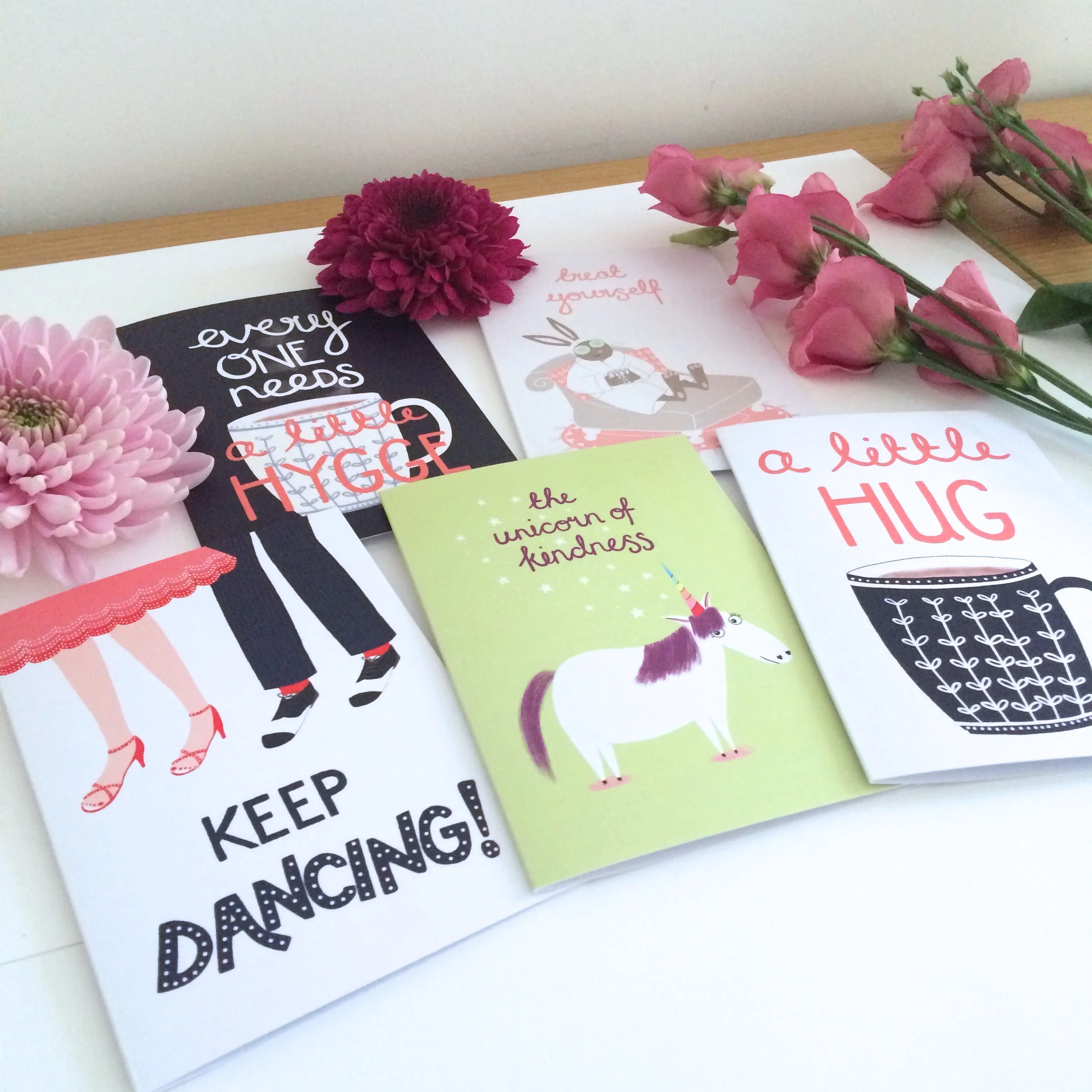
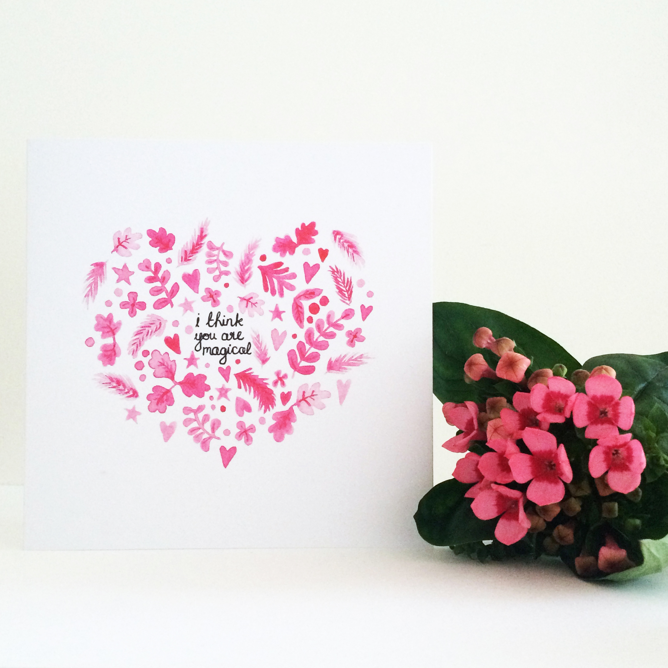
This week I've added a new product to my Etsy shop, Pretty Post by And So We Begin. Pretty Post is a selection pack of 8 assorted cards from my collection that you can buy at the brilliant price of just £15 AND you'll also get a little treat just for you!

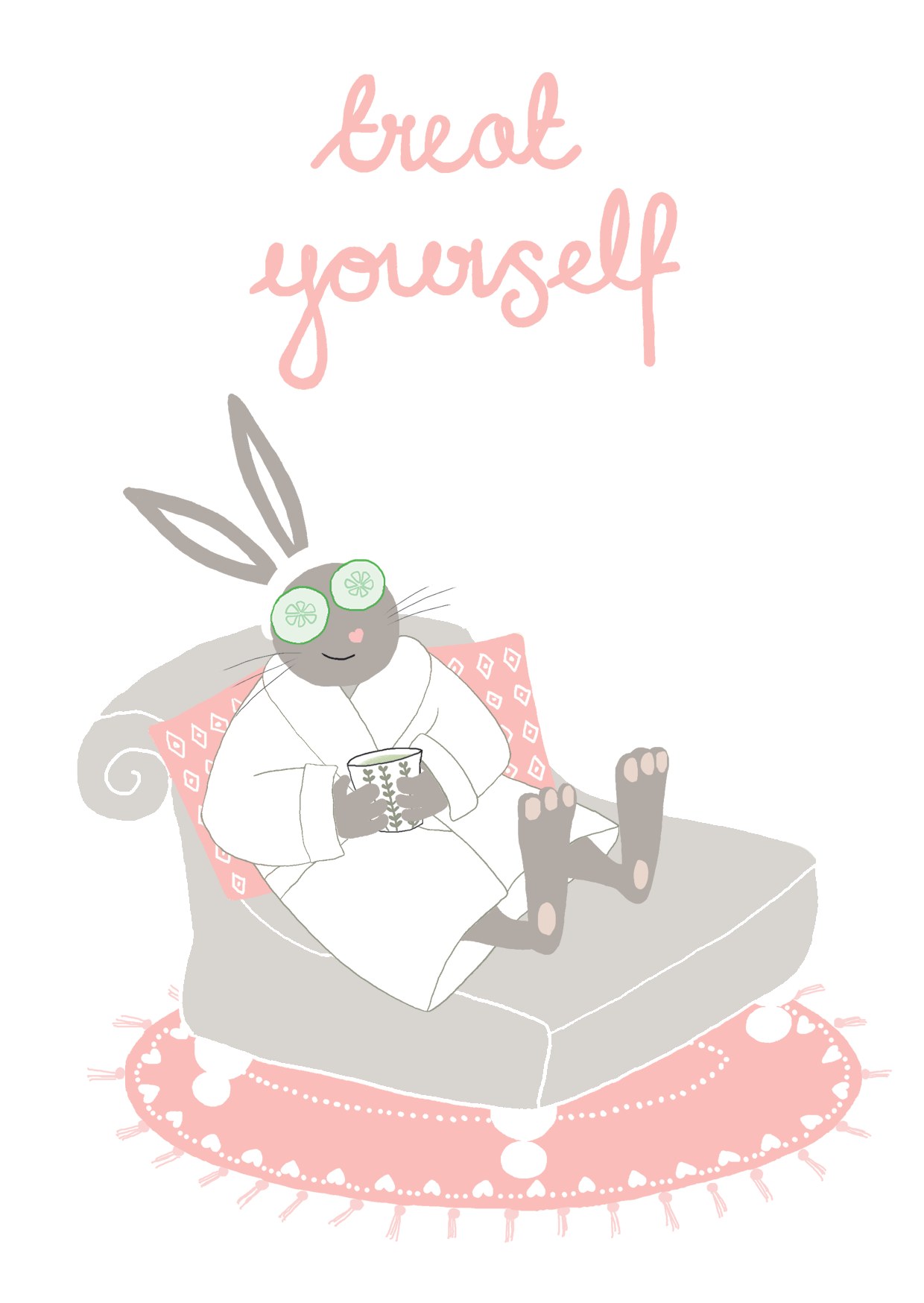
I'm going to aim to produce a new collection of 8 cards every three months so you can buy Pretty Post regularly and will always have new designs to add to your collection. Then every time you need a card, you will have one to hand. The cards are suitable for birthdays and you'll find something in the pack for any occasion. Or just send a card to make someone smile.

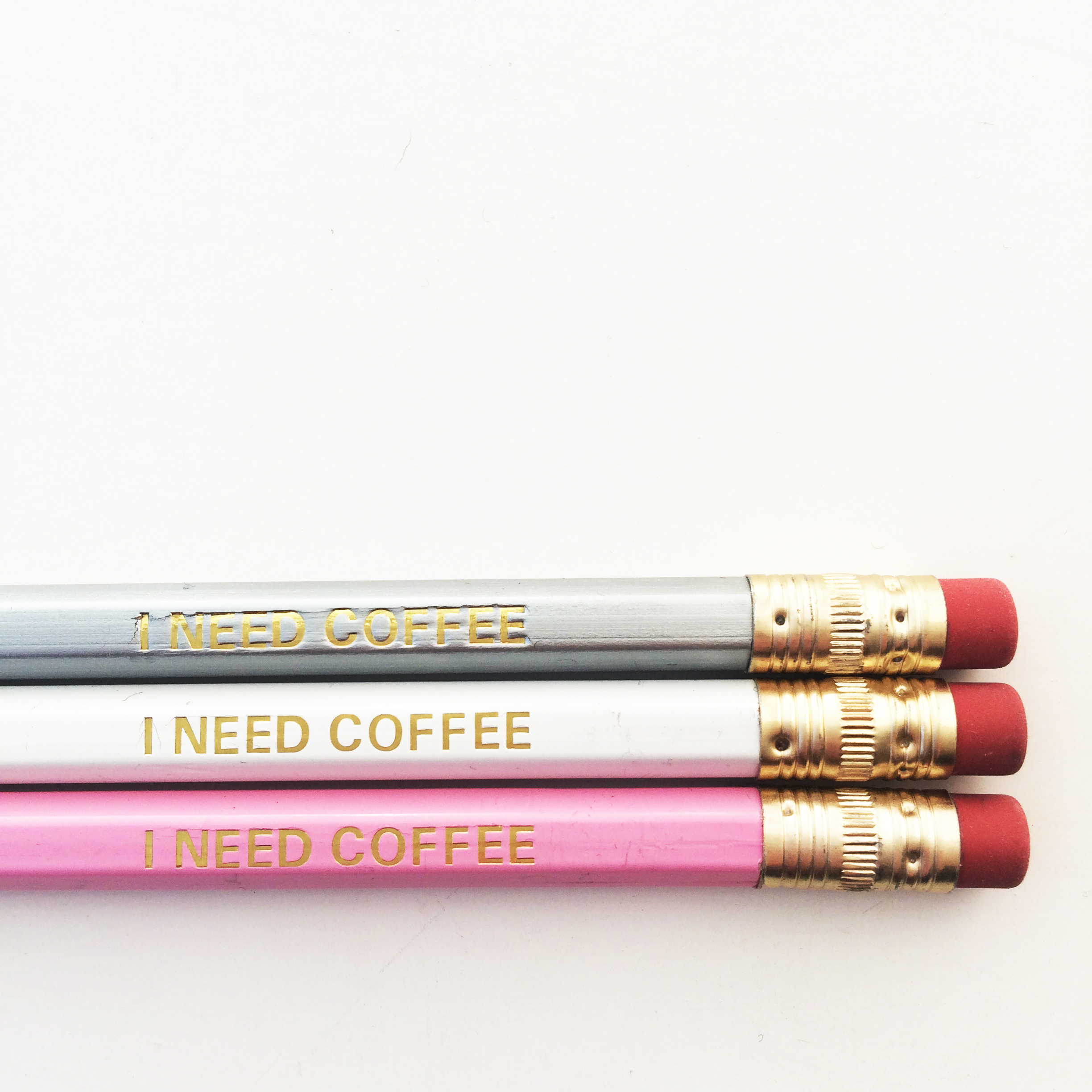
This month's FREE little treat just for you is a pretty Stars & Ideas Notebook complete with an I Need Coffee pencil. Because we all have ideas and we all need coffee, right? : )

Pop over to my Etsy shop to have a closer look!

Adding Products To Etsy

My new cards arrived yesterday so it was time for another mini photoshoot! I'm becoming quite speedy at taking pictures now as I have more of an idea of how I'd like them to look. Adding products feels like it is really time-consuming when you first start doing it but definitely gets easier. Now I can copy previous product descriptions rather than writing them fully from scratch and I'm also able to use presets for postage costs.

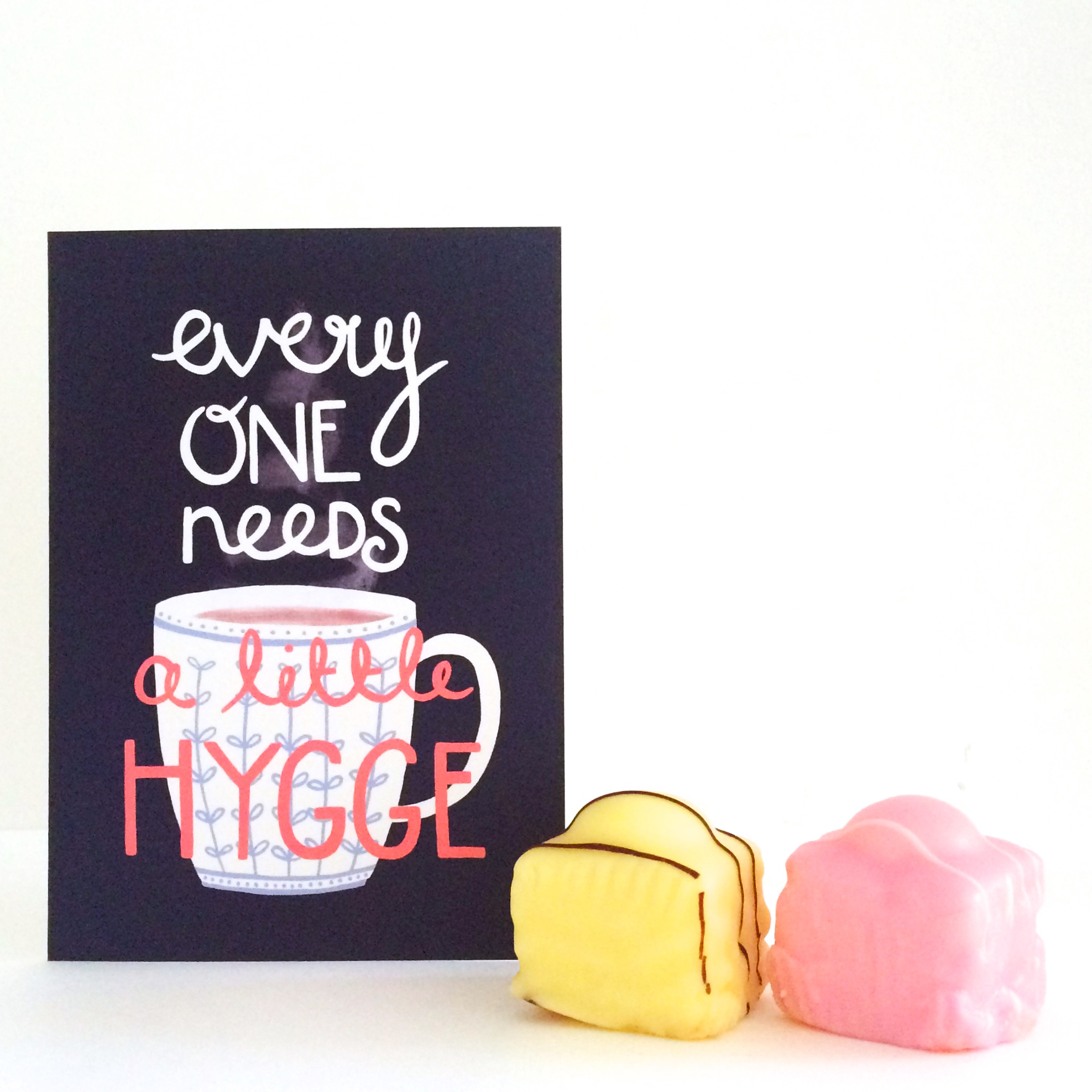
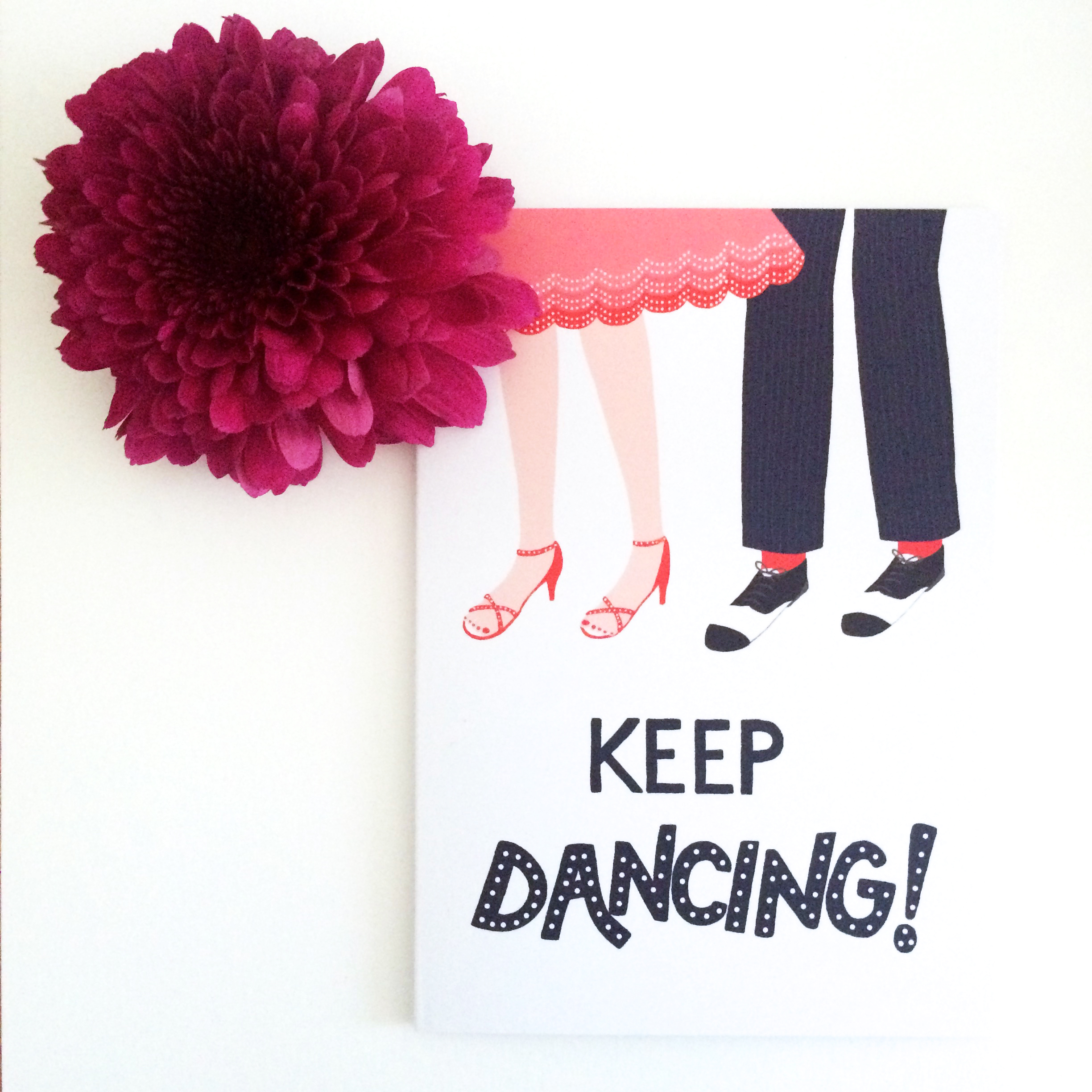
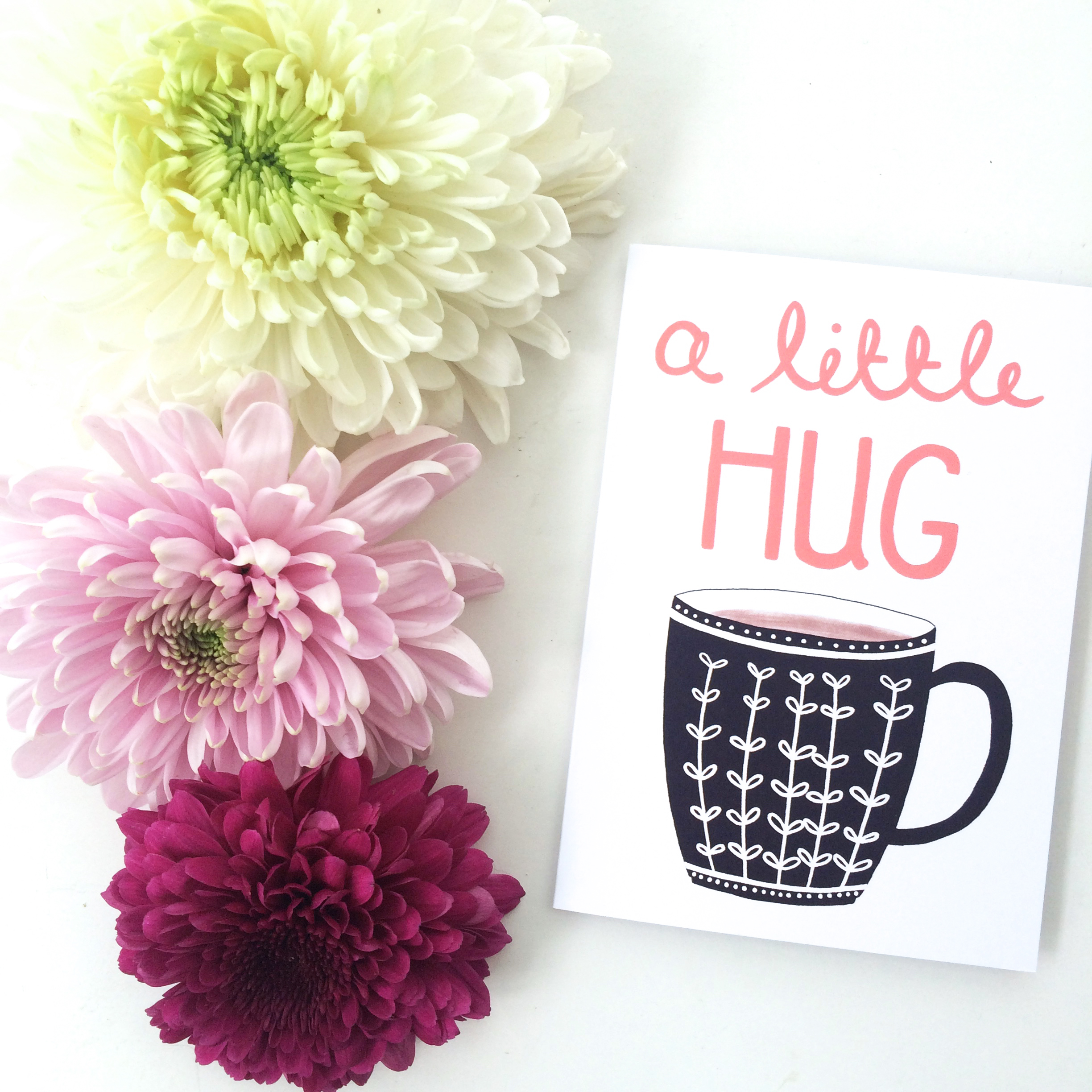
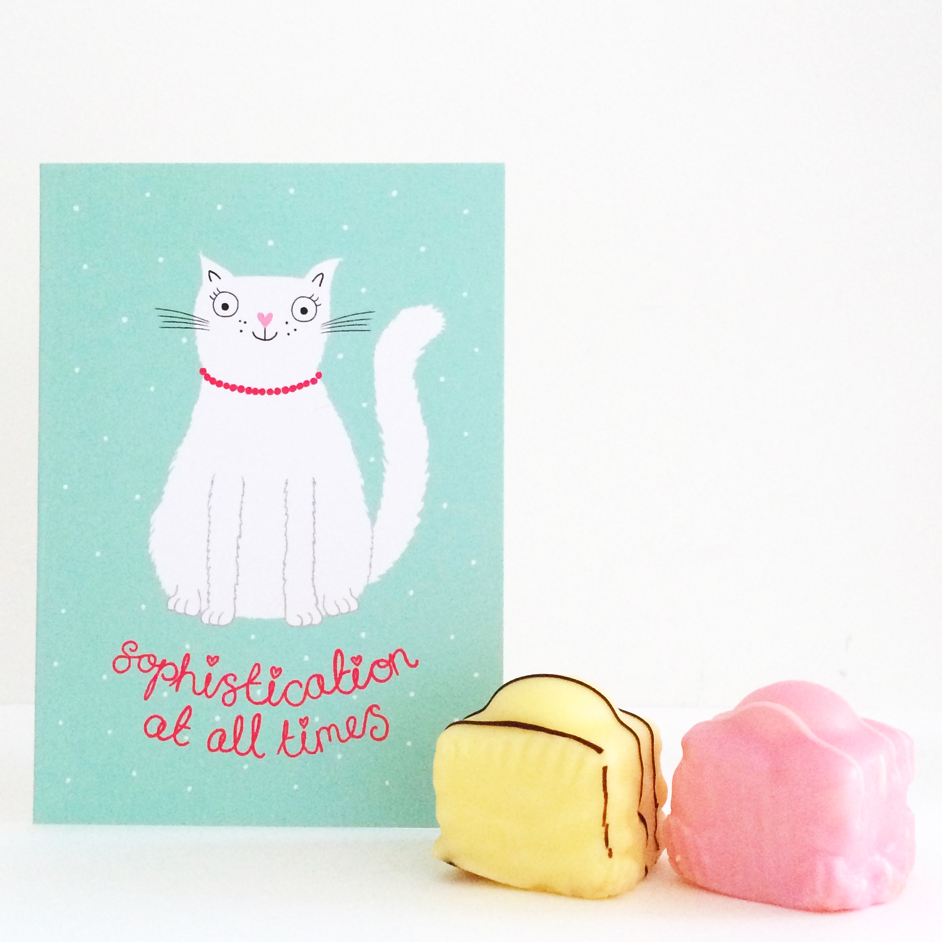
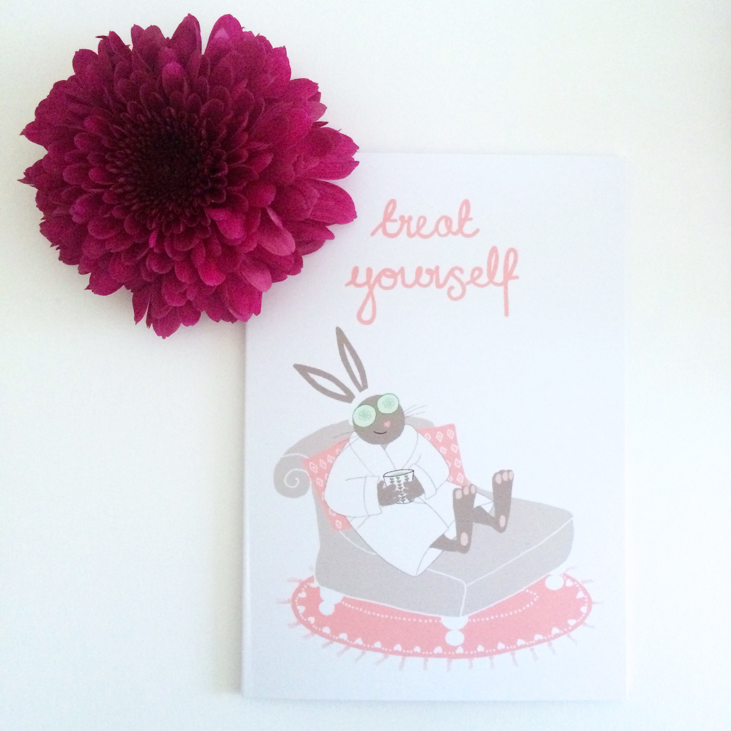
My latest set of cards is all about the feel-good factor so I set up my cards with flowers and my favourite fondant fancies as props (I managed to only eat two). The light was quite gloomy so I used a white background again and then upped the exposure in Photoshop to make it seem as if it was a summer's day! I quite enjoy the methodical process of tweaking the photos and uploading them. The process also gives me a full set of images to use on social media and to promote the products.

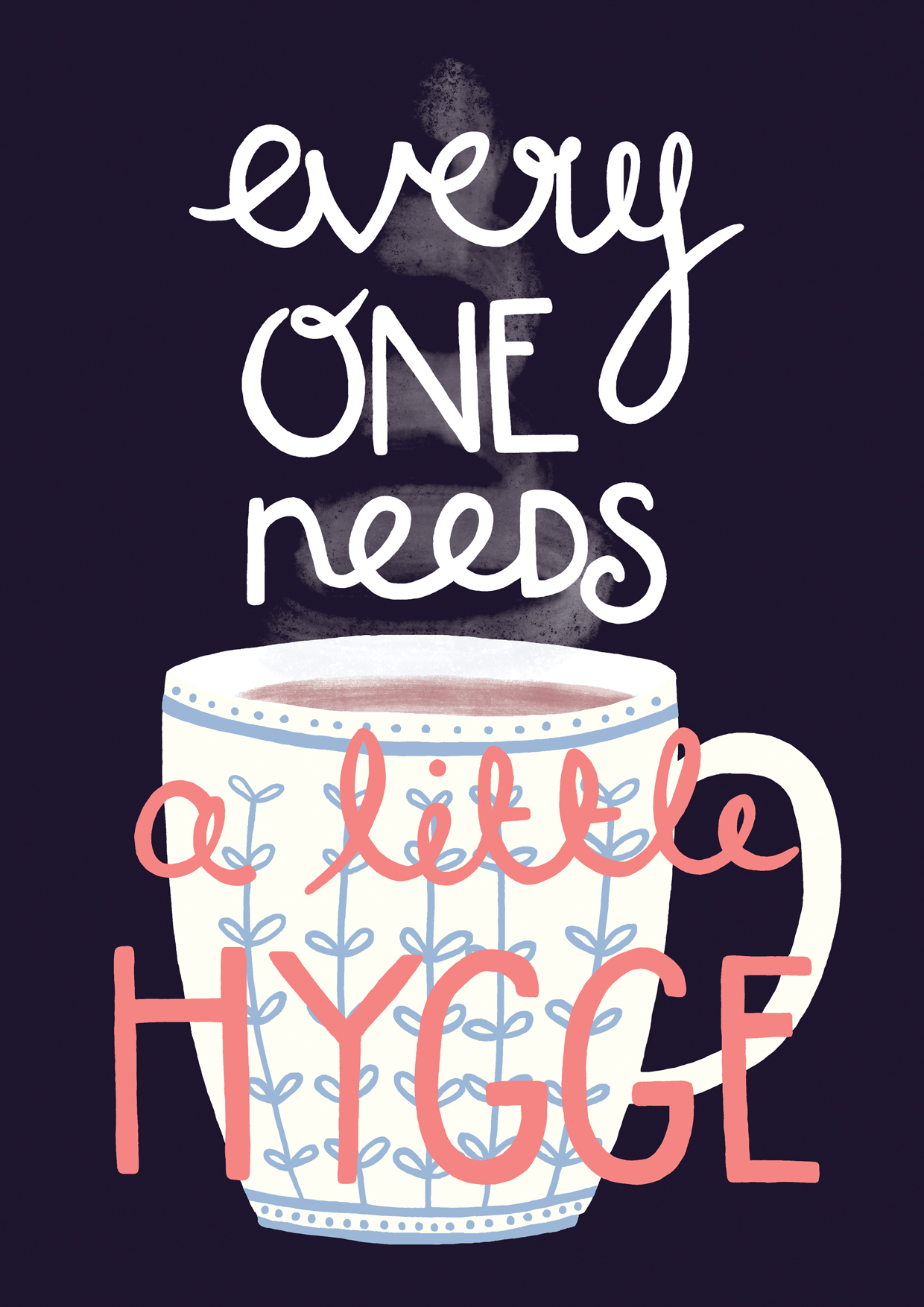
The next challenge is to really start focusing on getting my shop *seen* by new buyers. So far my hygge print seems to be what's drawing people in and I hope some of these new cards will also start to catch people's eyes.

Cards For Kindness & Keeping Going

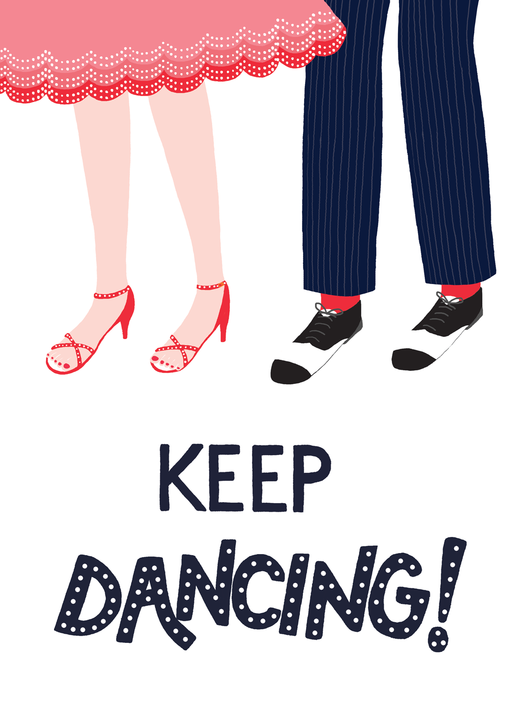
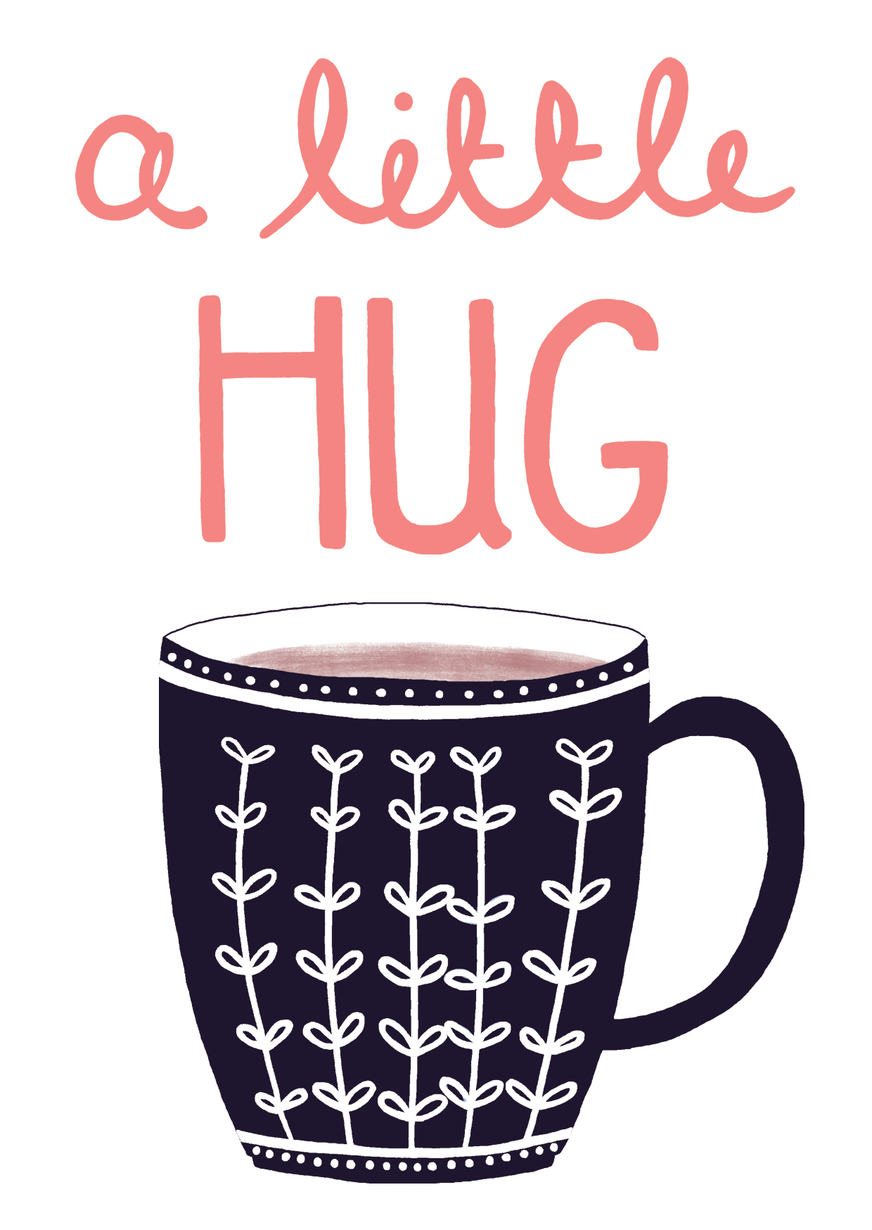
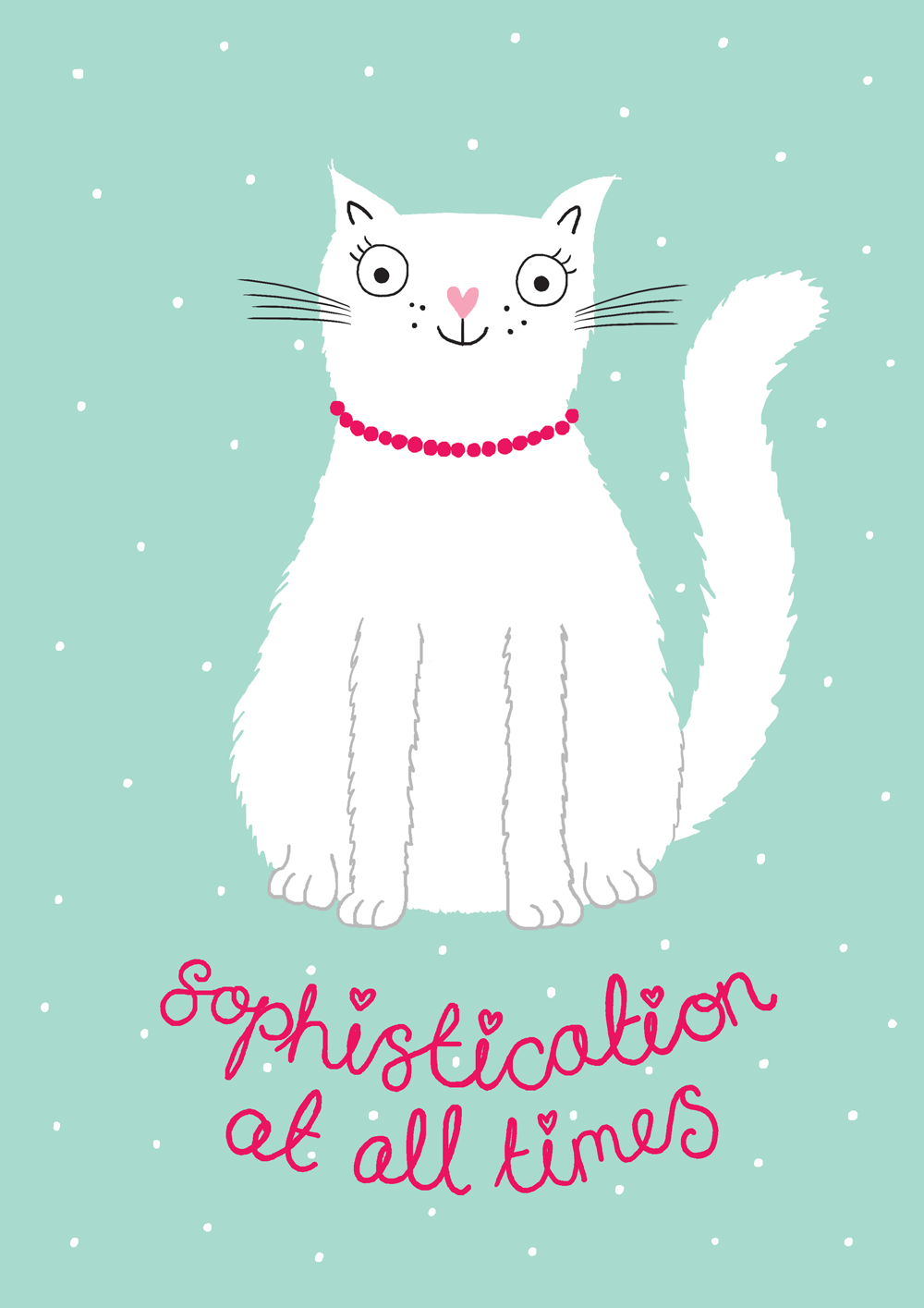
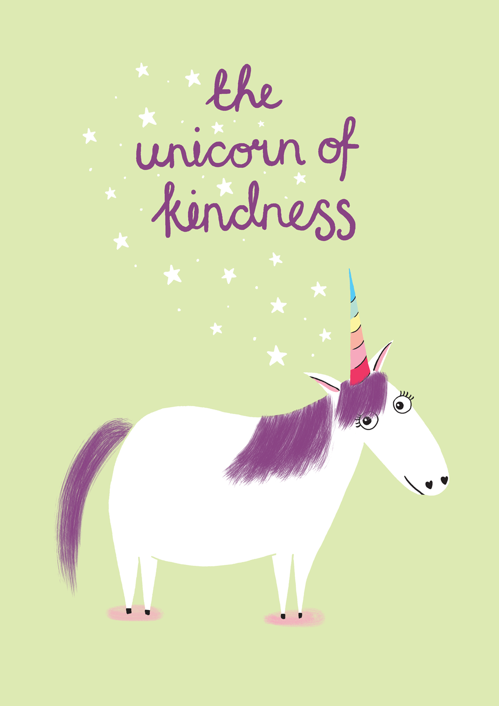
With various craft fairs coming up I wanted to add to my collection of cards a little and I've been particularly thinking about offering cards that people can send 'just because'. My latest mini collection is all about kindness and keeping going and will be on sale in my Etsy shop by next week.

A Christmas Photoshoot

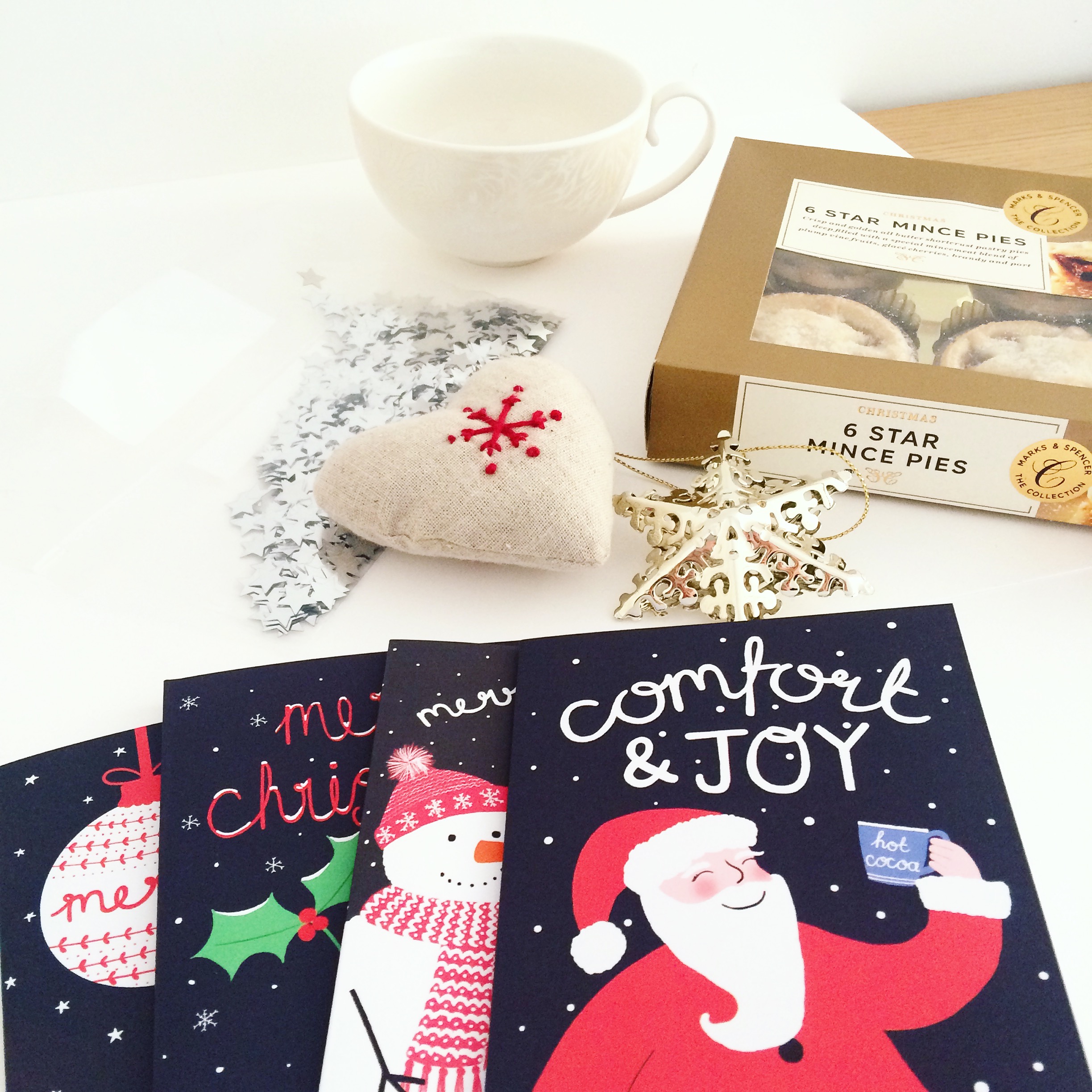
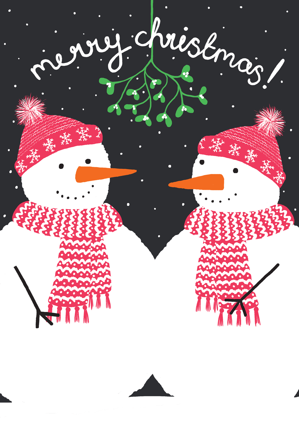
My Christmas cards arrived super speedily from Printed.com so this morning I was able to photograph them to pop them onto my Etsy shop. The light was just right with a lovely autumnal blue sky and I had already bought some *props* (aka snacks) in preparation.

Once again I used white card as a base so that the photos had a clean, light background and I sprinkled some silver stars around to add a little bit of sparkle. I took several snaps of each card to ensure I had plenty of pictures to choose from and then tweaked them a little in Photoshop before adding my new listings to Etsy while enjoying a very yummy mince pie.

I'll soon be adding more Christmas cards and some little stocking fillers to my shop but in the meantime please enjoy a little browse around (preferably while eating a mince pie).

Let The Festivities Begin!

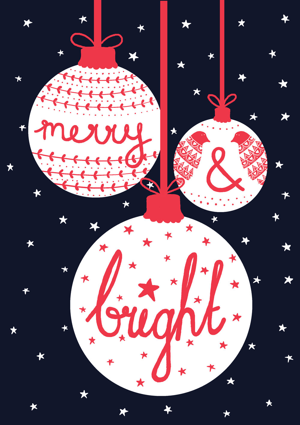
This week my desk has been all about Christmas! I popped my fairy lights on and put Arthur Christmas on Netflix to get me in the mood and got started on the first of my Christmas cards. The four designs below will be in my Etsy shop and on Choosey.com late next week. There are two more designs to come, plus a little collection of Christmas stocking fillers that I am working on. I also used it as a good excuse to have my first mince pie of the season. Let the festivities begin!

Sending Out My First Etsy Orders

It sounds daft but once your Etsy shop is alive and kicking, it somehow comes as a surprise when buyers actually start to order things from you. After spending so much time and care creating something behind closed doors, it feels like such a compliment that someone likes your products enough to buy them. It's lovely to earn a few pennies but it's so much more than that. Creating for me is about sharing a little bit of myself, it's making something tangible that expresses a part of myself and it's so nice when someone connects with that.

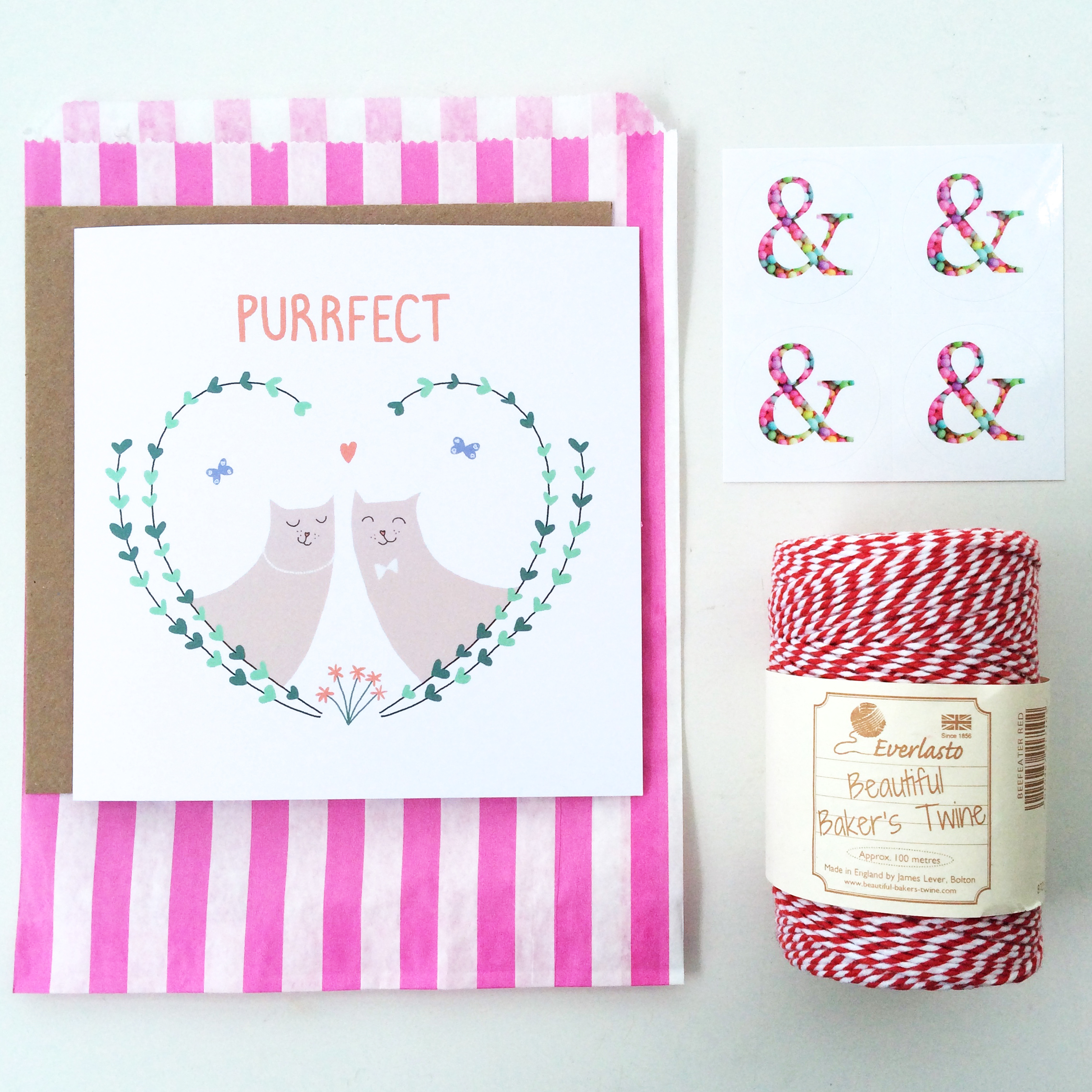
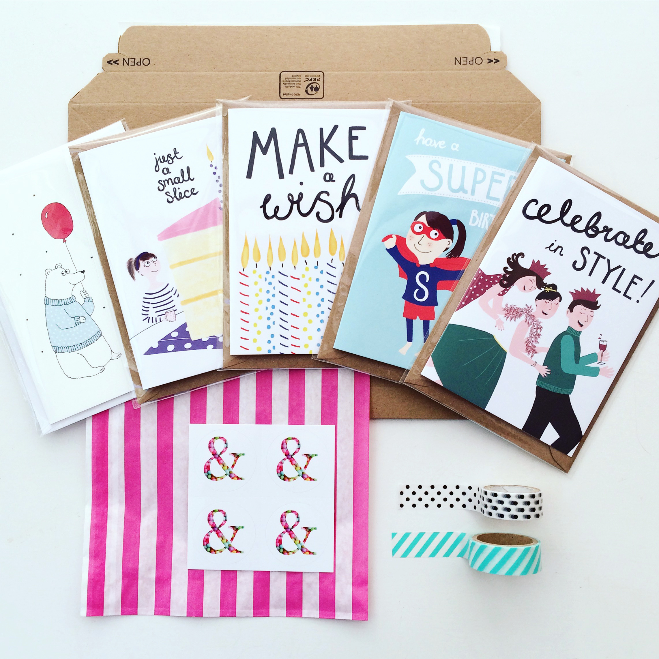
To manage expectations and to allow me to prioritise and schedule my time, I state on my Etsy shop that I send orders out on Fridays and Saturdays. So yesterday, I found myself wrapping up the first ones. Each with a candy stripe paper bag, And So We Begin sticker and a personalised message. I love thinking about someone receiving something lovely in their letterbox rather than a bill and then sending their cards out and sharing that love with someone else. It's so simple but makes me very happy indeed.

Etsy Photoshoot

As an independent you really do find yourself having to be a jack of all trades sometimes. Setting up an Etsy shop is really satisfying and also takes several skills. After creating your products the next step is to make sure they all look super tempting to your potential buyers by putting your photography skills to the test.

Here are my top four tips for good product photos for your Etsy shop.

1. Take photos in natural light.
I have a real aversion to flash photography as it makes things look slightly unreal and over-exposed. Position your products near a window and make sure there aren't any unsightly shadows. If it's a bit of a dull day, you can always brighten your images up in Photoshop or a photo app before uploading.

2. Ensure you have a white background.
A clean, clear background will help to show your products at their best. I faked my white surface by using white card as a base underneath my products. Limit clutter and ensure the product is the focus of the image.

3. Use props.
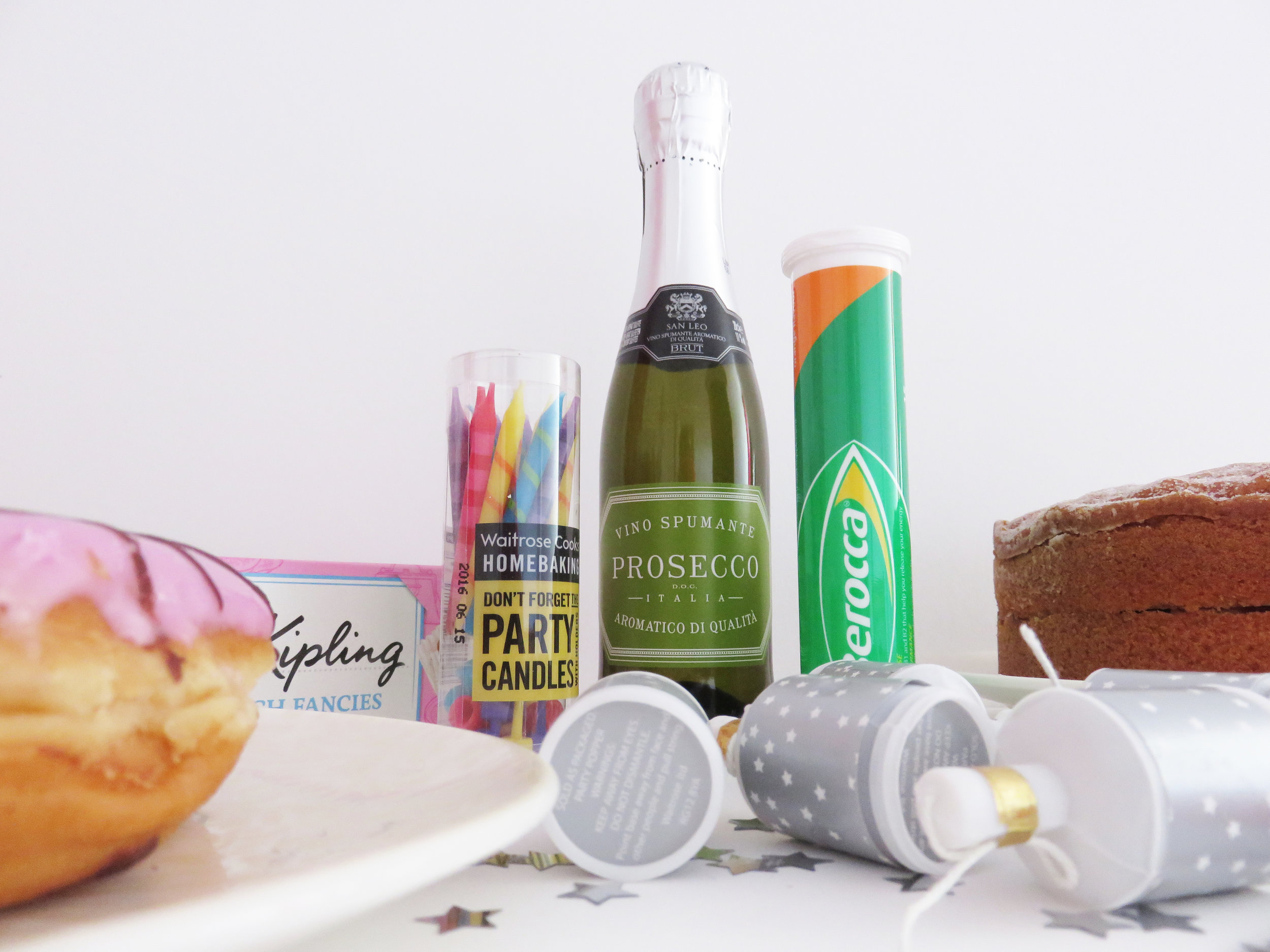
I think it's quite fun to take photos of products in an environment so that buyers can see them in context. I look for pictures like this when I buy products on Etsy as I feel it puts them in context and sells a 'feeling' as well as the design to the buyer. I wanted my greetings cards to look cosy, fun and warm so I added sparkly stars, cake, party poppers and candles to my pictures. You can see all of my finished pictures on my Etsy shop!

4. Show your packaging.
I love the small details that Etsy buyers add to their products. Many add a personal card, a sticker or pack their products in tissue paper or a pretty bag. I like to show my packaging in my photos as I hope it shows that I really care about every single order and every single buyer.

I hope that you find these points helpful. Have a browse around my shop and let me know what you think!

I'm also taking part in the #inktober challenge on Twitter by drawing black and white ink illustrations. My Etsy photoshoot gave me great inspiration today (and was also a great excuse to eat all of the leftover cake!)

A Parcel From The Printer

EtsyCardsBoxed.jpg

Today was an exciting day as the first batch of greetings cards for my Etsy shop arrived from the printer. Whenever I open a box of new products that I've created I feel like George McFly when he opens his box of books in Back To The Future. It's so fun seeing something you've put so much time and effort into come to life.

I've used a variety of printers in the past and this time I used Printed.com. I wanted an uncoated matte finish with Kraft style envelopes and flexibility to use my own designs on the front and the back. Printed.com offered all of these things and I'm really happy with the results.

If you are sending some of your own designs off to print for the first time, here are my top five things to think about.

1. File type
Make sure you save your files exactly as the printer needs them. Each print service details their requirements on their site. Most will be happy with 300dpi jpgs or pdfs. If you've got any questions or concerns, contact the printer before you commit to your order.

2. Colour profile
Ensure your print files are saved as CMYK so that the colours are true to your design. I am not an expert so check this with your printer first but I have only come across one printer who preferred RGB colour settings. As I understand it, if your file is RGB you should never simply re-save as CMYK as this will upset the colour balance.

3. Bleed
Printers will advise what bleed they require at the edge of your files. This is essentially a bit of extra space around the file to allow the finished product to be trimmed therefore allowing the colour to print right to the edge.

4. Card type
I've tried a few different card types in my last couple of print runs of greetings cards. Some printers offer 'Trucard' which is said to be specifically for cards. It has a silky finish on the outside and is uncoated inside (for easy writing). However, I find it a bit too pristine and prefer the more simple and basic finish of uncoated card. If you're not sure, ask for some samples before committing to your order.

5. Envelopes
Check if your printer can provide envelopes and if so what colours and textures are available. Envelopes are part of your product and help to the set the tone of your brand. I've chosen brown 'kraft' envelopes as I wanted to add a cosy, homely feel to my cards.

My next step is to set up a photoshoot for my cards to show them off in my Etsy shop. I'll write another blog post about this soon!