Another Sneak Peek
I've been drawing whenever I can this week to try to keep pushing my picture book project forwards. It's very satisfying ticking off the pages. I'm now on page 11 of 26 so a little way to go but...
Read MoreI've been drawing whenever I can this week to try to keep pushing my picture book project forwards. It's very satisfying ticking off the pages. I'm now on page 11 of 26 so a little way to go but...
Read MoreI've really enjoyed working on a couple of celebration commissions this month. My client gave me several photos and a list of things that make her think of the recipients to work from. I then sketched out a suggested composition for each picture and worked closely with my client to ensure the pictures really reflected the girls' personalities.
Do get in touch via my contact page if you'd like to discuss a commission for someone you love.
Over the past few weeks I've been starting work on my new picture book. My first book, Angel's Great Escape, was written by me but illustrated by the fabulous Kristyna Litten. At the time I didn't think I could draw at all and loved how Kristyna seemed to see things in exactly the same way as me.
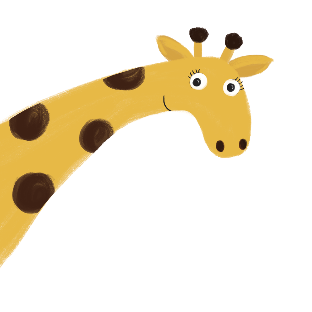
Since then I have practiced drawing almost every day and my new picture book project is a way for me to practice and to challenge myself. I'll be writing several blog posts over the coming months about my process and what I learn but for now, here's a sneak peek at one of the characters I've been working on.

I added these pretty pencils to my shop last week. I use them every day for my to do lists and on-the-go sketching and they make my day just a little bit more sparkly.
They come in white, pink or silver, all with gold foil writing and are sold in a set of four packed in a pink candy stripe bag. Perfect for a little gift or for a little treat for yourself : )
Buy yours by clicking on the picture below!
The #colour_collective challenge has been running on Twitter for two years now. It's a lovely community of artists and illustrators and also a brilliant incentive to practice drawing each week. Lovely Penny Neville-Lee started the challenge and continues to post a new colour every Saturday. We then all create a piece inspired by that colour and post our pictures at 19:30 GMT on the following Friday evening.
The first colour of this year was Aureolin Yellow. Here's my contribution : )

This week I've added a new product to my Etsy shop, Pretty Post by And So We Begin. Pretty Post is a selection pack of 8 assorted cards from my collection that you can buy at the brilliant price of just £15 AND you'll also get a little treat just for you!
I'm going to aim to produce a new collection of 8 cards every three months so you can buy Pretty Post regularly and will always have new designs to add to your collection. Then every time you need a card, you will have one to hand. The cards are suitable for birthdays and you'll find something in the pack for any occasion. Or just send a card to make someone smile.
This month's FREE little treat just for you is a pretty Stars & Ideas Notebook complete with an I Need Coffee pencil. Because we all have ideas and we all need coffee, right? : )
Pop over to my Etsy shop to have a closer look!
This is the third year I've taken part in #illo_advent over on Twitter. It's what started me drawing when I was having a really tough time in my personal life. I took up the challenge of drawing a Christmas themed illustration from 1st - 24th December and it helped to distract me. I shared my drawings and become part of a lovely community of creative people. It was therapy, company and just good fun.
This year the illustrations that are being shared by everyone are absolutely beautiful. If you've got five minutes to while away I highly recommend a browse. Here are my 24 pictures for 2016.
This week, with a little help from my lovely neighbour who is a graphic designer, I've been teaching myself how to make an animated gif with Photoshop. As a (very!) small business, I have little or no budget for marketing so find myself trying to do lots of things myself. This actually means I am always learning and teaching myself new skills.
I wanted to make a brief animation to help to promote my picture book Angel's Great Escape on social media and didn't really know where to start. Luckily, you can learn almost anything these days by finding tutorials to watch online (and with the help of kindly neighbours!).
I am fairly comfortable with Photoshop but I only know the basics and hadn't really played with multiple frame animated gifs much before. Here's a link to one of the many tutorials but have a look around and find one you feel comfortable with. I created something quite basic but here are a few notes about what I've learnt.
1. An animated gif is created by turning the layers of the Photoshop file into frames and cycling through them. The animation below has 145 frames so 145 layers. It's basically a stop animation that puts me in mind of the old school animation techniques of my childhood favourites like Bagpuss and the Clangers. I used one layered PSD file to create each scene or layer and merged the visible layers then copied it and dropped it into the file that was going to be animated. I then went back to the layered PSD, undid the merge and repositioned the scene then did the same process again. And again! In each scene I moved Angel and Father Christmas a little further across. I nudged each one a maximum of 5 or 6 cursor taps each time to ensure that the finished product was fairly smooth. But at the same time, I nudged each up or down a tiny bit to give the movement a bit of a wobble as I wanted the animation to look quite rustic. I imagine there are several ways to achieve the same result but this process helped me to keep track of what I was doing and to be methodical.
2. I created the file at 1500 px x 1500 px in case I need to use it for anything else but then reduced it down to 400 px x 400 px when I saved it to help to reduce the file size. These dimensions seem to work well on mobile phone apps.
3. I was able to upload the animated gif directly to Twitter but had to save it as a video to upload it to Instagram. And for Facebook I needed to upload it to my website and then link to it from there. Once again there are lots of tutorials online that I used to help! Here's one that neatly summarises each process.
So much of the learning process to create the gif below has been trial and error. I enjoyed experimenting with the settings, composition and movement and making something that actually looks Father Christmas is flying by! I hope you have fun creating your own animated gifs too.

Today, I am very excited to announce that my first self-published picture book Angel's Great Escape, illustrated by Kristyna Litten, is finally available in print! For those who have followed my progress you will know that this has been quite a journey that has taken more than four years to complete. And quite a bit longer than that when I realise I first had the idea over ten years ago!
I will write a detailed blog post soon about my self-publishing journey but for now I wanted to celebrate the fact that a long-held dream is now a reality and I'm so excited to finally be sharing my little Christmas story in print! I really hope that you and the little ones in your life enjoy it this festive season!
Four years ago I started work on a project that became my passion, turning a little story I had written into something that I could share with others. Angel's Great Escape was the reason I started my little company and the start of a journey that is still winding. At the time, I hadn't really started drawing and I really wanted to work with someone who was experienced. Luckily the lovely team at Arena Illustration introduced me to Kristyna Litten who visualised the characters exactly as I saw them. Together with book designer Sarah Goodwin and app creator Stefan Nowak we created a product that could be shared around the world. (And I'm excited to say the book will soon finally be available in print but more on that later!)
I loved working with Kristyna and was so chuffed to read in the Arena newsletter this week that she was commissioned to work with Aardman Animations on the new DFS adverts. Kristyna created illustrations of DFS employees and these were then adapted by Aardman to produce animated adverts. You can read a lot more about the project and see Kristyna's drawings here. And here's the first advert. It's so cute and has all the hallmarks of Aardman's warm and cosy style. Lovely. Congratulations Kristyna!

My new cards arrived yesterday so it was time for another mini photoshoot! I'm becoming quite speedy at taking pictures now as I have more of an idea of how I'd like them to look. Adding products feels like it is really time-consuming when you first start doing it but definitely gets easier. Now I can copy previous product descriptions rather than writing them fully from scratch and I'm also able to use presets for postage costs.
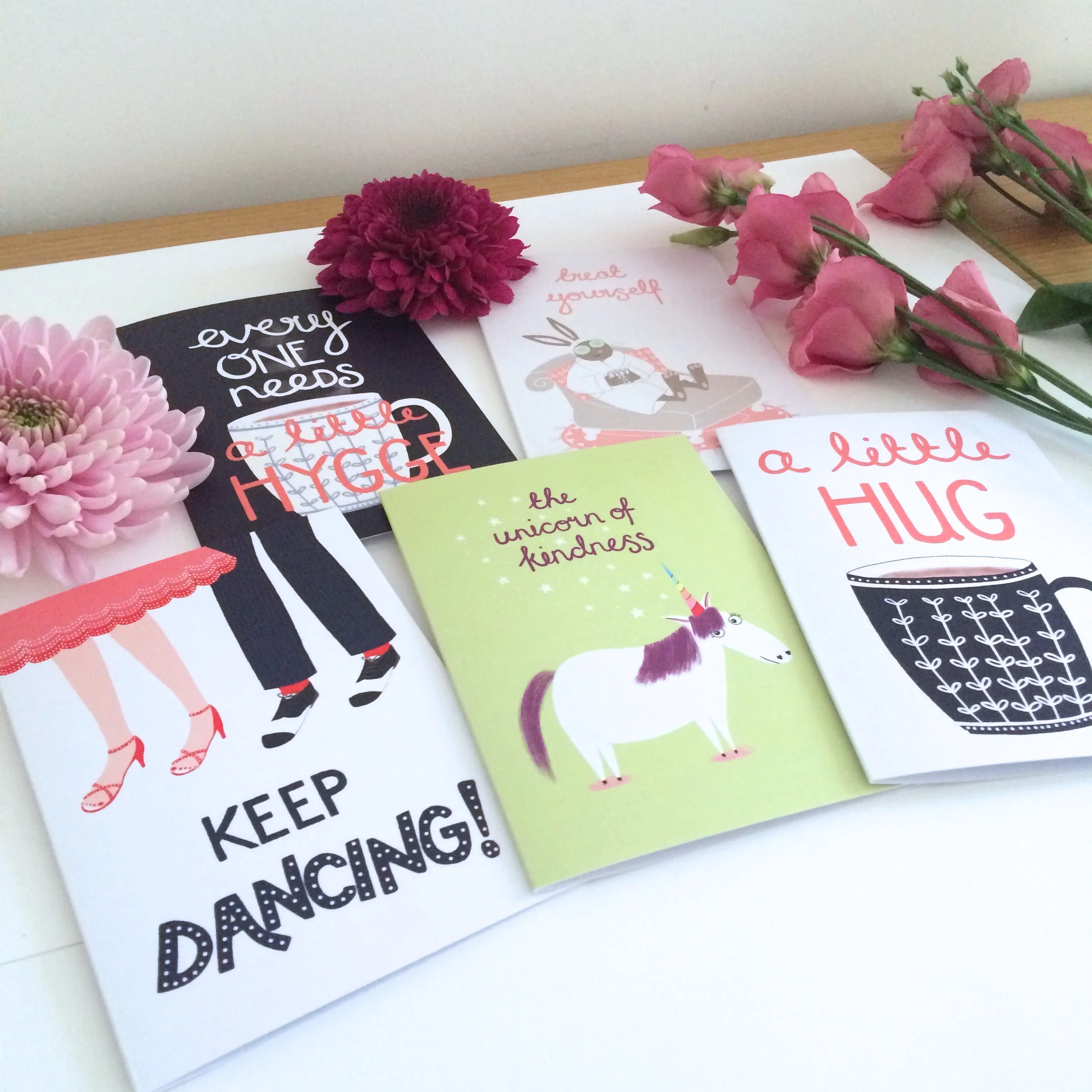
My latest set of cards is all about the feel-good factor so I set up my cards with flowers and my favourite fondant fancies as props (I managed to only eat two). The light was quite gloomy so I used a white background again and then upped the exposure in Photoshop to make it seem as if it was a summer's day! I quite enjoy the methodical process of tweaking the photos and uploading them. The process also gives me a full set of images to use on social media and to promote the products.
The next challenge is to really start focusing on getting my shop *seen* by new buyers. So far my hygge print seems to be what's drawing people in and I hope some of these new cards will also start to catch people's eyes.
As well as cards, notebooks and prints, I'd like to sell some little stocking fillers on my stall at the craft fairs I am attending and in my Etsy shop. Today I have sent these little lovelies off to print. Each of these four designs will be printed on a little pocket mirror (just 6cm wide). I'd love to find one of these in my stocking and hope you'll enjoy giving them to your friends as a mini treat. Perfect for handbags and purses.
With various craft fairs coming up I wanted to add to my collection of cards a little and I've been particularly thinking about offering cards that people can send 'just because'. My latest mini collection is all about kindness and keeping going and will be on sale in my Etsy shop by next week.
I'll be adding some stocking fillers to my shop very soon including these six new notebook designs. My hygge design is proving popular so I thought it would be fun to have a product with it on and the other designs are all brand new. Each notebook will have a spotty or starry inside cover to give a little extra splash of colour and 48 plain pages for notes, sketches and ideas. I really hope that you like them and will enjoy jotting your own creative ideas down in them!
I'm using Awesome Merchandise to print these. Print feels like it can be quite complicated (!!) and they have been super helpful handling my queries. They also have lots of very helpful templates so that you can ensure that you have the right dimensions and the correct amount of space at the edges of designs to ensure that they get trimmed correctly. I can't wait for the notebooks to be delivered so I can share some pictures with you!
As I've mentioned, I'm busy creating lots of little stocking fillers for the upcoming craft fairs that I'll be attending. This morning, my to do list got interrupted by a sudden need to draw this little character accompanied by a phrase that I say to the little ones in my life all the time (with a cheeky smile of course). I think she'll be finding her way onto some stocking fillers very soon!

I enjoyed a really nice browse around the Renegade Craft Fair in London yesterday. As I'm busy planning my first few craft fairs I wanted to do a bit of research about how to set up a stall and also to meet some of the makers and to buy a few treats!
I picked up some really useful tips about how to display greetings cards, how to add a bit of sparkle to your display and ensuring there is a bit of height to things so that you can easily catch the eye of prospective buyers as they walk by. There were some absolutely lovely stalls that looked really professional and inviting. I chatted to several creatives about their products and about how nerve-wracking it is doing fairs for the first time. Every one advised me that all their fellow makers are lovely and that half the fun is chatting to people who are in the same situation as you. It feels like a really lovely community to be a part of.
Here's a little glimpse at a couple of the treats I bought! Links to the makers websites below.

1. Annie Dornan-Smith - www.anniedornansmith.co.uk
2. Plewsy - www.plewsy.com
3. Oh Squirrel - www.ohsquirrel.co.uk
I love taking part in various drawing challenges on Twitter and occasionally post a contribution to the #pinchpunchpost hashtag. Each month they name an animal to draw and everyone posts on the 1st of the month. This month the theme was an owl and although I was a little late I couldn't resist taking part. I was feeling particularly inspired by the fact that the little ones are so obsessed with Harry Potter at the moment. So this little owl has a very important delivery to make... And he's feeling a little daunted!
I sketched my owl on a bumpy train journey and sat down to draw him in Photoshop last night. I wanted to try out some Kyle T Webster brushes that I haven't used very much yet to see what I could do with them. I created the animated gif below so that you can see the layers that went into the finished piece. I'm so excited about the possibilities with the brushes. It's like a whole world of texture has opened up to me!
For those who use (or want to use) Kyle's brushes, I used the following to create my little owl.
* Gouache A-Go-Go
* Gouache Less Dry
* My New Favourite Inker

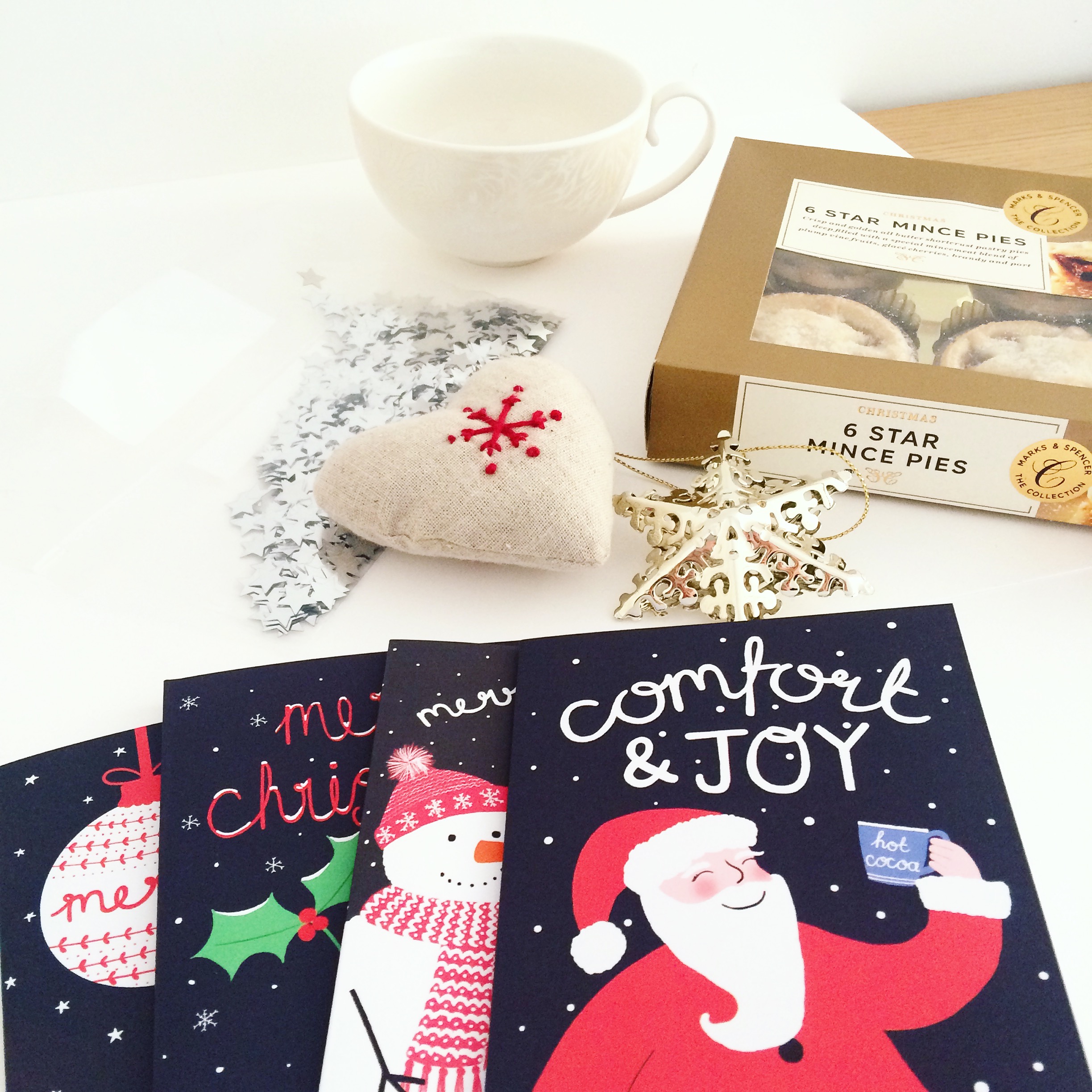
My Christmas cards arrived super speedily from Printed.com so this morning I was able to photograph them to pop them onto my Etsy shop. The light was just right with a lovely autumnal blue sky and I had already bought some *props* (aka snacks) in preparation.

Once again I used white card as a base so that the photos had a clean, light background and I sprinkled some silver stars around to add a little bit of sparkle. I took several snaps of each card to ensure I had plenty of pictures to choose from and then tweaked them a little in Photoshop before adding my new listings to Etsy while enjoying a very yummy mince pie.
I'll soon be adding more Christmas cards and some little stocking fillers to my shop but in the meantime please enjoy a little browse around (preferably while eating a mince pie).


A little while ago I designed a logo for the foodie website Eat Your Words.
The lovely ladies who started the site are now branching out with their own YouTube channel. The channel will be launching later this week but in the meantime here's their trailer.
I love how they have taken the logo and 'Monty Python'ed it.